This is my last challenge of the year and what better way to round things off than with everyone’s favourite chart – the bar chart – but let’s make it “sexy”.
Bar charts may be simple but when you combine them with some interactive highlighting and sorting you can create something quite dynamic which can surface a range of insights.
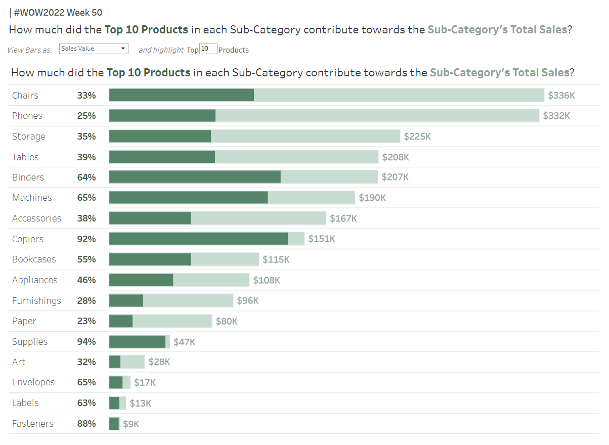
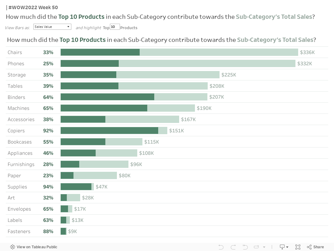
Let’s build a bar chart which highlights the proportion of Sales within each Sub-Category which can be attributed to the Top N products sold.
For each Sub-category, highlight how much the Top N products contributed towards the Sub-category’s total sales
Display this Top N Sales quantity as a percentage of the Sub-category total
Allow the user to Sort the bars by Total Sub-Category Sales or by the Percentage covered by the Top N Products (ie: the value calculated above)
When the bars are Sorted by Total Sub-Category Sales, display the total value at the end of the bars
When the bars are Sorted by Percentage, display the bars as a Percent-of-Total stacked bar chart.
(I recommend interacting with the Viz to understand these two points better)
Match tooltips and formatting (choose your own colours =D )
Dataset
This week uses Sample Superstore data (v2022.2). You can find it here on Data.World. Note: If you use older versions of Superstore your values may appear slightly different.
Attribute
When you publish your solution on Tableau Public make sure to take the time and include a link to the original inspiration. Also include the hashtag #WOW2022 in your description to make it searchable!