This week’s challenge is one I’ve been waiting to share with you. It has a bit of everything, so I hope you enjoy it!
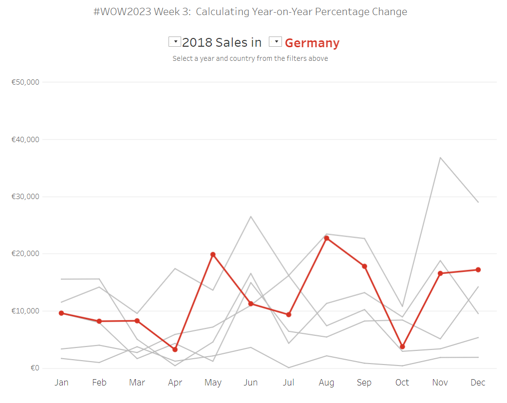
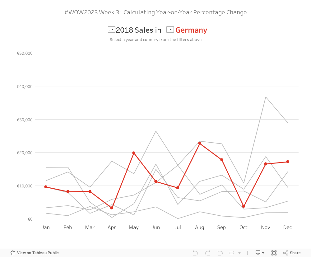
The goal is to visualize the Sales in a given year for different countries in Europe, with an indicator in the tooltip to identify whether this value has increased or decreased compared to the previous year. Make sure each country has its own colour.
Each country must have a different colour associated with it
Create a line chart of the Sales by Month with a separate line for each of the 6 countries shown (France, Germany, Italy, Netherlands, Spain, United Kingdom)
Watch out for any Nulls
Tooltip: Include the Year-on-Year Percentage Change (comparing each month’s Sales to the same month in the previous year)
Dataset
This week uses the EU version of Superstore. You can find it here on Data.World.
Attribute
When you publish your solution on Tableau Public make sure to take the time and include a link to the original inspiration. Also include the hashtag #WOW2023 in your description to make it searchable!