Introduction
This July we bring you another month of challenges with a theme:
We are going RETRO!
Each coach will be going back through the WorkoutWednesday archives and re-vizzing a challenge from the past. It may be one of their favourite challenges, or maybe there’s a much easier way to do things now.
This week’s challenge takes inspiration from Ann Jackson’s challenge from 2018 Week 38. We bring in some of that “new” interactivity that is probably quite familiar now like: Parameter Actions, Set Actions, Show/Hide Containers and Dynamic Zone Visibility.
Unfortunately, the “retro” element of this challenge is that it may take you a while to complete (sorry!). I usually try to really narrow in on the challenging components of a viz, but I went (almost) all in on this one. On the plus side, should you choose to take on this challenge, you will have a fantastic interactive dashboard to showcase on your Tableau Public profile.
Good luck!
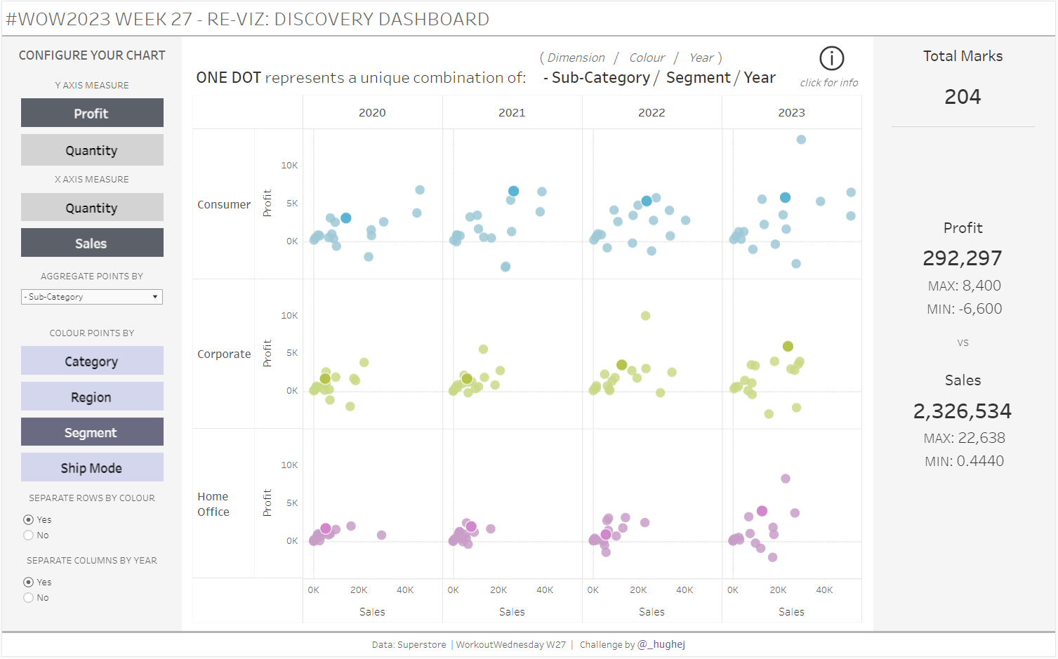
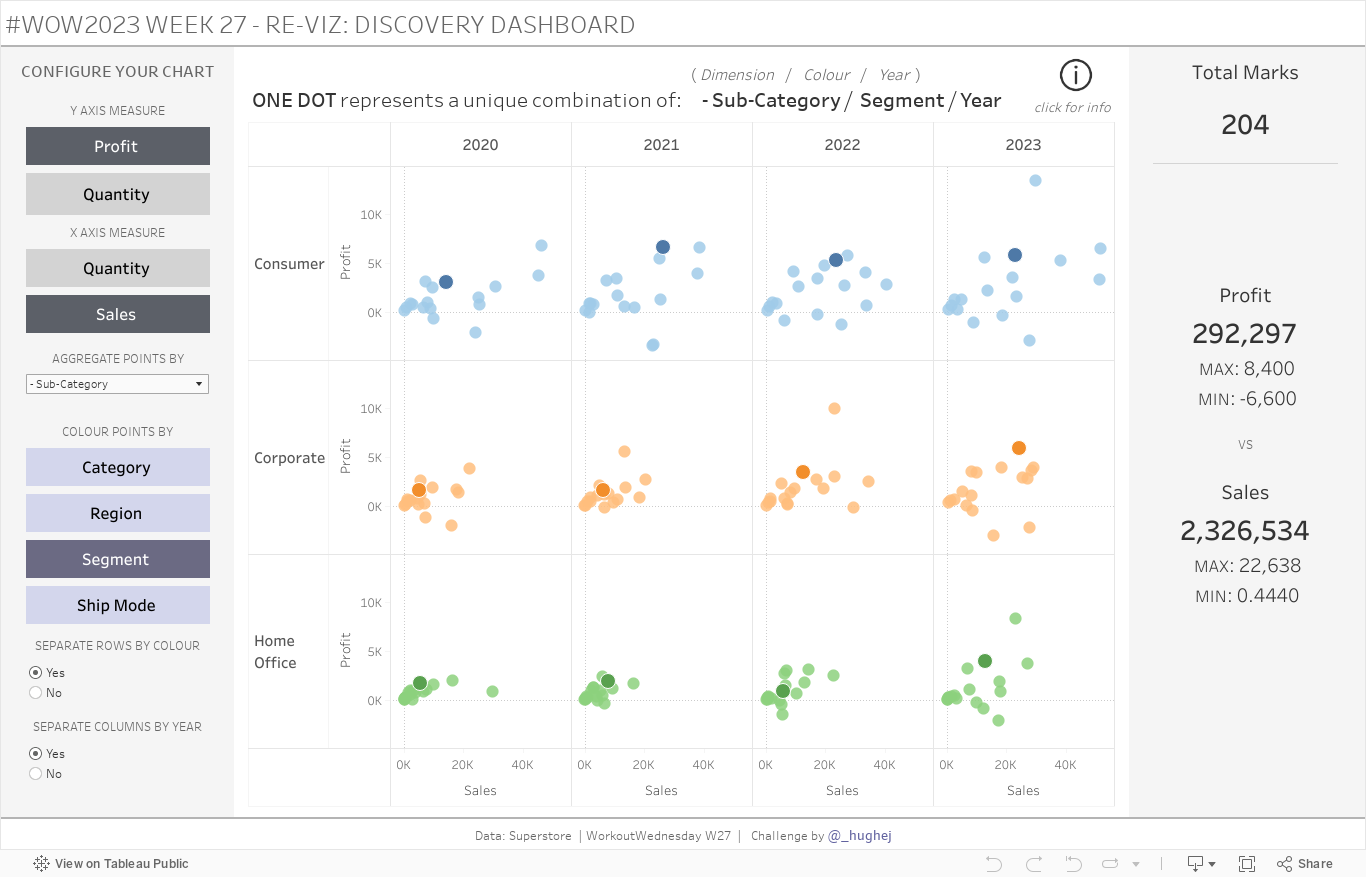
Requirements
- Dashboard Size: 1366 x 850px
- Sheets: As many as you need
- Main feature – a scatter chart (further details below for Tableau users at different levels)
- Lots of interactivite elements/customisation features included in Levels 2 and 3
- Create a scatter chart of Profit vs Sales
- Colour the chart by Segment and use Sub-Category and Year for Detail
- Create KPIs for Total Marks, Profit and Sales, as in the example.
- Use containers to layout the dashboard
- Match tooltips and formatting
Level 2 requirements:
- Allow the user to select a Measure for each axis (I used Profit, Sales and Quantity)
- Use Year of Order Date in Detail and allow the user to select a second dimension used in the Detail for the scatter chart (I used Category, Sub-category, Product, Region, State and City)
- Allow the user to select the dimension used to Colour the points in the chart (I used Category, Region, Segment and Ship Mode)
- Give the user the choice to separate the chart into Columns by the Year
- Give the user the choice to separate the chart into Rows by the dimension used in Colour
- Include dynamic KPIs
- Match tooltips and formatting and apply colour appropriately.
Level 3 requirements:
- First complete all Level 2 requirements
- Make sure that the user cannot select the same Measure for both axes. (For example: If Profit is selected for the Y-axis, only Sales or Quantity should be an option for the user for the X-axis)
- Allow the user to highlight all points that correspond to a particular Dimension category (for example: If Sub-Category is on Detail, the user should be able to select all points in the chart that relate to ‘Accessories’
- When the years are not separated by columns, draw a line between the years of the same colour to create a connected scatter plot for the selected Dimension category (for an example: select ‘No’ in the option to ‘Separate Columns By Year’ and then click on a point in the chart).
- Include an instruction button to help inform the user that they can interact with the viz by selecting a mark.
Dataset
This week uses an adapted Superstore data set. You can find it here on Data.World
Attribute
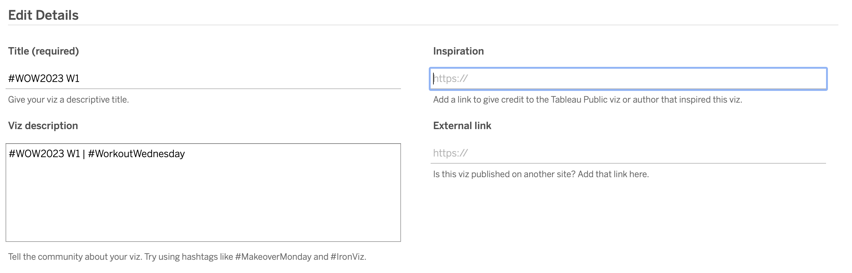
When you publish your solution on Tableau Public make sure to take the time and include a link to the original inspiration. Also include the hashtag #WOW2023 in your description to make it searchable!
Share
After you finish your workout, share on Twitter and/or LinkedIn using the hashtag #WOW2023 #Tableau and tag @WorkoutWednsday and @_hughej
Solution
Interactive