Introduction
As we continue Global Recognition Month here at WOW Towers, I’d like to introduce you to Norbert Borbás (@norbert_borbas), a data analyst from Hungary who has been on a mission this year to complete all the #WOW2023 challenges. He has received 4 Viz of the Day awards, and was recognised as ‘one to watch’ in the #TableauNext2023 cohort. Over to you Norbert….
Norbert’s Challenge Introduction:
[HU]
Sziasztok!
Köszönöm Donna a meghívást, hogy vendég coach lehetek a #WOW-ban! Németországból, Münchenből jelentkezem, de mivel eredetileg Magyarországról származom, így az Inclusion Hónap keretében a kihívás leírása magyar nyelven is elérhető. Alább hadd osszam meg veletek az e heti feladat inspirációját.
Mi az egyik legérdekesebb dolog az olyan munkákban, mint a miénk? Mindennap új dolgokat tanulhatunk.
Sokszor a különböző analitikai közösségekből, leginkább a Tableau #datafam-től merítek inspirációt a mindennapi munkámhoz. Ez a kihívás egy olyan business követelményen alapul, amelyet nemrég kellett megoldanom, és amelyhez mindenhonnan ötleteket gyűjtöttem. Ezzel a dashboarddal hadd próbáljak meg visszaadni egy kis inspirációt Nektek.
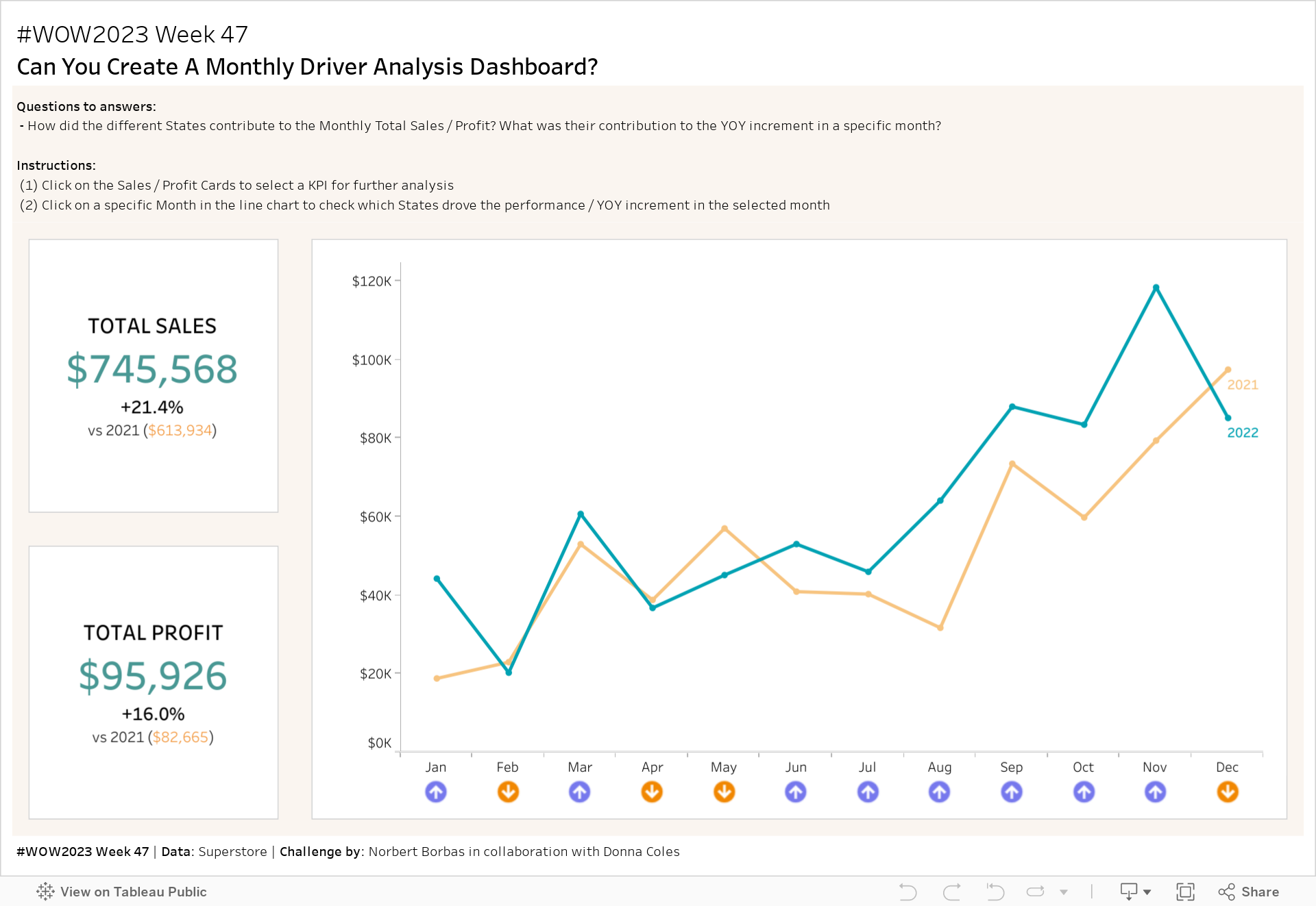
2 évnyi Superstore adatot hasonlítunk össze, de a hangsúlyt a havi Salesre / Profitra és az évenkénti változásra (YOY) helyezzük, amit havi szinten vizsgálunk. Valószínűleg California egy magas árbevételű állam, de vajon ott rejlenek a növekedési lehetőségek? Szeretnénk megérteni, hogy mely államok hajtották havi szinten a YOY teljesítményt, a feladat végén a YOY növekedésük alapján felállított rangot is kimutatva.
[EN]
Hi People!
Thank you Donna for the invitation to be a guest coach in #WOW! Tuning in from Munich, Germany, but I’m originally coming from Hungary, so in the name of the Inclusion Month the challenge description is also available in the Hungarian language. Let me share with you the inspiration for this week’s exercise.
What is one of the most interesting things in jobs like ours? We can learn new things every day.
Many times, I get inspiration for work cases from various analytics communities, especially the Tableau #datafam. This challenge is based on a business requirement I had to solve recently, for which I used ideas from all around. With this dashboard, let me try to give back a piece of inspiration to You.
We will compare 2 years of Superstore data, but our focus will be on Monthly Sales / Profit and the monthly Year-Over-Year change. Probably California is a high-Sales state, but is that where growth opportunities lie? We want to understand which States drove the YOY performance, showing a Rank based on their YOY increment in the end.
Requirements
[HU]
- Dashboard mérete: 1200 x 800
- Worksheetek száma: 5-öt használtam, de nyugodtan használhatsz annyit, amennyit csak akarsz
- Adat: Superstore (én a 2022.4-es verziót használtam, de bármelyik verzió megfelel)
- (1) BAN-ok
- Hozz létre 2 BAN-t, a Salesnek és a Profitnak
- Mutasd meg a 2022-es (a Superstore bármelyik évét használhatod) és a 2021-es összesített adatokat a YOY %-os változással együtt
- A BAN-okra kattintva kiválasztjuk vagy a Salest vagy a Profitot, amit a Vonaldiagramon és a Driver Analysis worksheeten fogunk látni
- (2) Vonaldiagram
- Hozz létre egy vonaldiagramot, amely a kiválasztott KPI-t (Sales vagy Profit) mutatja évenként
- Hozz létre egy worksheetet nyilakkal, amely megmutatja, hogy a havi KPI szám magasabb vagy alacsonyabb-e, mint a tavalyi érték
- A vonaldiagramra vagy a nyilakra kattintva kiválasztunk egy hónapot ÉS át kell váltanunk a Driver Analysis nézetre
- (3) Driver Analysis
- Próbálj meg csak 1 worksheetet használni (+ fejléc szöveges objektumokkal).
- Államonkénti bontásban jelenítsd meg a következő mérőszámokat:
- A kiválasztott hónap Salese vagy Profitja 2022-ben egy oszlopdiagrammal, ugyanez a 2021- es hónap egy referenciavonallal
- A kiválasztott hónap 2022. évi Sales vagy Profit rangsora, valamint egy nyíl, amely jelzi, hogy a rangsor milyen irányban változott 2021 azonos hónapjához képest
- A kiválasztott hónap 2022. évi Salesének vagy Profitjának YOY növekedése
- A kiválasztott hónap YOY növekedésének rangsora 2022-ben, a pozitív és negatív hozzájárulás esetén külön-külön megjelenítve a rangsort (pl. a legnagyobb növekedés az első oszlopban az 1-es rangsorral rendelkezik, míg a legnagyobb csökkenés szintén az 1-es rangsorral rendelkezik, de a második oszlopban)
- Adj hozzá egy gombot, amely a Kezdőlapra navigál vissza
- Egyeztesd a tooltipeket
- Egyeztesd a színeket, vagy használj saját palettát:
- 2022: #00a2b3
- 2021: #f7c480
- Növekedés: #7678ed
- Csökkenés: #f18701
[EN]
- Dashboard size: 1200 x 800
- Number of sheets: I used 5 worksheets and a couple of Text objects, but feel free to use as many as you like
- Data: Superstore (I used the 2022.4 version, but any version is ok)
- (1) BANS
- Create 2 BANs, for Sales and Profit
- Display the Totals for 2022 (you can use any year in Superstore) and 2021 with the YOY % change
- The BANs should be used to select either Sales or Profit to be displayed on the Monthly Chart and the Driver Analysis
- (2) Line Chart
- Create a line chart showing the selected KPI (Sales or Profit) by Year
- Create an arrow indicator to show if the monthly KPI number is higher or lower, than last year
- A click on the line chart or on the arrow indicators should select a month AND switch to the Driver Analysis view
- (3) Driver Analysis
- Try to use only 1 sheet (+ header text objects)
- Display the following metrics by State:
- The Sales or Profit of the selected month in 2022 with a bar chart, same month in 2021 being a reference line
- The Rank of Sales or Profit of the selected month in 2022, plus an arrow indicating in which direction the Rank changed vs same month in 2021
- The YOY Increment of Sales or Profit of the selected month in 2022
- The Rank of the YOY increment of the selected month in 2022, displaying the Rank separately for Positive and Negative contribution (e.g. the largest increase has Rank 1 in the first column, while the largest decrease has also Rank 1, but in the second column)
- Add a button that navigates you to the Landing view
- Match the tooltips
- Match the colours or use your own palette:
- 2022: #00a2b3
- 2021: #f7c480
- Increase: #7678ed
- Decrease: #f18701
Dataset
This week uses the 2022.4 Superstore data set. You can find it here. Or feel free to use any version of Superstore you have.
Attribute
When you publish your solution on Tableau Public make sure to take the time and include a link to the original inspiration. Also include the hashtag #WOW2023 in your description to make it searchable!
Share
After you finish your workout, share on Twitter and/or LinkedIn using the hashtag #WOW2023 #Tableau and tag @WorkoutWednsday, @donnacoles30, @norbert_borbas
Solution
Interactive