Introduction
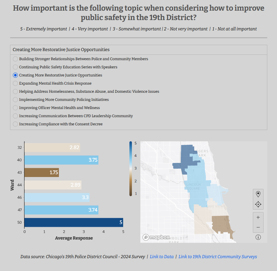
A few weeks ago, the 19th Police District of Chicago emailed me with some interesting survey data. The visualizations were useful, but they were living inside of a Google Slides presentation, and I wanted to dig deeper into the results. Thankfully, I followed my nose to their community survey website and found that they shared the raw (de-identified) data publicly!
This got me thinking – when I used to play around in Tableau, I would pull down data from the City of Chicago Data Portal and visualize it using GeoJSON data to map out the different wards and neighborhoods in the city. I realized I’d never done that in Sigma! I was excited to find that it’s actually *incredibly simple* to create a map visualization in Sigma, even with CSV Geography data! Let’s dig in and see what we can build together.
This might also be the first time we use Data Models in a Workout Wednesday, so it’s an added bonus!
Need access to Sigma?
Note: You will only have view access to WOW Workbooks, Folders, and Workspaces, not edit access. Please create your WOW Workbooks under “My Documents.” We suggest creating a folder to organize all your workbooks.
Requirements
- Getting your data
- Add a new table element where the source is the ‘Chicago 19th Police District – Survey Responses and Ward Geography’. It should be in the ‘2024W24 – Can you add custom map layers?’ folder
- Creating your map visualization
- Add a new Visualization element, change the type to ‘Map Geography’
- Set the source to the table you just worked on above
- Add ‘Ward Geography’ to the Geography section
- Change the ‘Color’ to ‘By Scale’
- Add ‘Response’ as the calculation, and update the calculation’s formula to be the Avg of response
- Change the color scale to the first option under ‘Diverging Color Blind’ at the very bottom
- Turn on ‘Customize Domain’
- Set the Minimum to 1
- Set the Maximum to 5
- Creating your bar chart visualization
- Add a new visualization element
- Set the source to the table you made in the first step
- Add ‘Ward’ to the X-axis
- Add ‘Response’ to the Y-axis, update the calculation to make it the average
- Complete the same ‘Color’ formatting as you did in the map, but right click after adding the field and uncheck ‘Show in Tooltip’
- Add the data labels to the inside of the bars, and change their color to white.
- Add the X and Y axis titles
- Pick either the bar chart or the map to display the legend.
- Create a control for the ‘Topic’ field, set the targets to both of the visualizations (you could also target the underlying table one time, if you’d like)
- Set the control type to ‘List Values’
- Select ONLY ‘Show Expanded List’, and ‘Required’
- Add the text boxes and dividers to your liking, adjust spacing to fit your page/screen size – I recommend collapsing the sidebar so you can get a good sense of what a viewer will see.
- Format the worksheet to be more compact
- Click the ‘Workbook Settings’ cog wheel icon in the bottom left
- Change the ‘Color’
- Set background to a light grey, make sure the middle color bar still shows up with your background color choices.
- Change the ‘Font’
- Set both Text and Data fonts to ‘Bitter’
- Change the ‘Layout Style’
- Page width = Medium
- Spacing = Small
- Uncheck ‘Show Cards’
Dataset
Workspaces > Workout Wednesday > 2024W24 – Can you add custom map layers? > Chicago 19th Police District – Survey Responses and Ward Geography
Share
After you finish your workout, share on LinkedIn, Sigma’s Community page, (or Twitter) using the hashtags #WOW2024 and #SigmaComputing, and tag Ashley Bennett, Eric Heidbreder, Katrina Menne, and Michal Shaffer!
Create an interactive, sharable version of your solution here.
Also, make sure to fill out the Submission Tracker so that we can count you as a participant this week to track our participation throughout the year.