Introduction
Tableau 2024.2 has recently released and I was excited to put together a New Features challenge for you all, including the Multi-Fact Relationship model and maybe a Viz Extension or two.
While I’ve had a lot of fun diving deep into learning about Multi-Fact Relationships, I pretty quickly encoutered a limitation for incorporating it into a challenge – this data model is not (yet) compatible with extracted data, which is essential when publishing to Tableau Public. When it comes to using it in a business, however, you should have no trouble connecting to Live data sources in a database. Meanwhile, we will have to patientiently await for the patch or the update that allows us to make fun challenges for you with this feature.
As for Viz Extensions? As far as I’m aware, the only one that is currently supported on Tableau Public is the Sankey diagram. Unfortunately, I did not have the time this week to pivot my challenge idea to bring this one to life for you. If you want to play around with the new charts available with Viz extensions, please note that there are a lot of customization and formatting limitations in the Free versions currently available. In practice, in a business setting, there are options to pay relatively small one-time fees to enable this additional functionality.
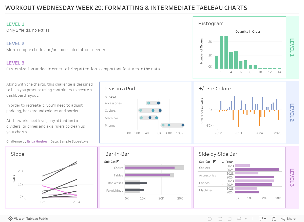
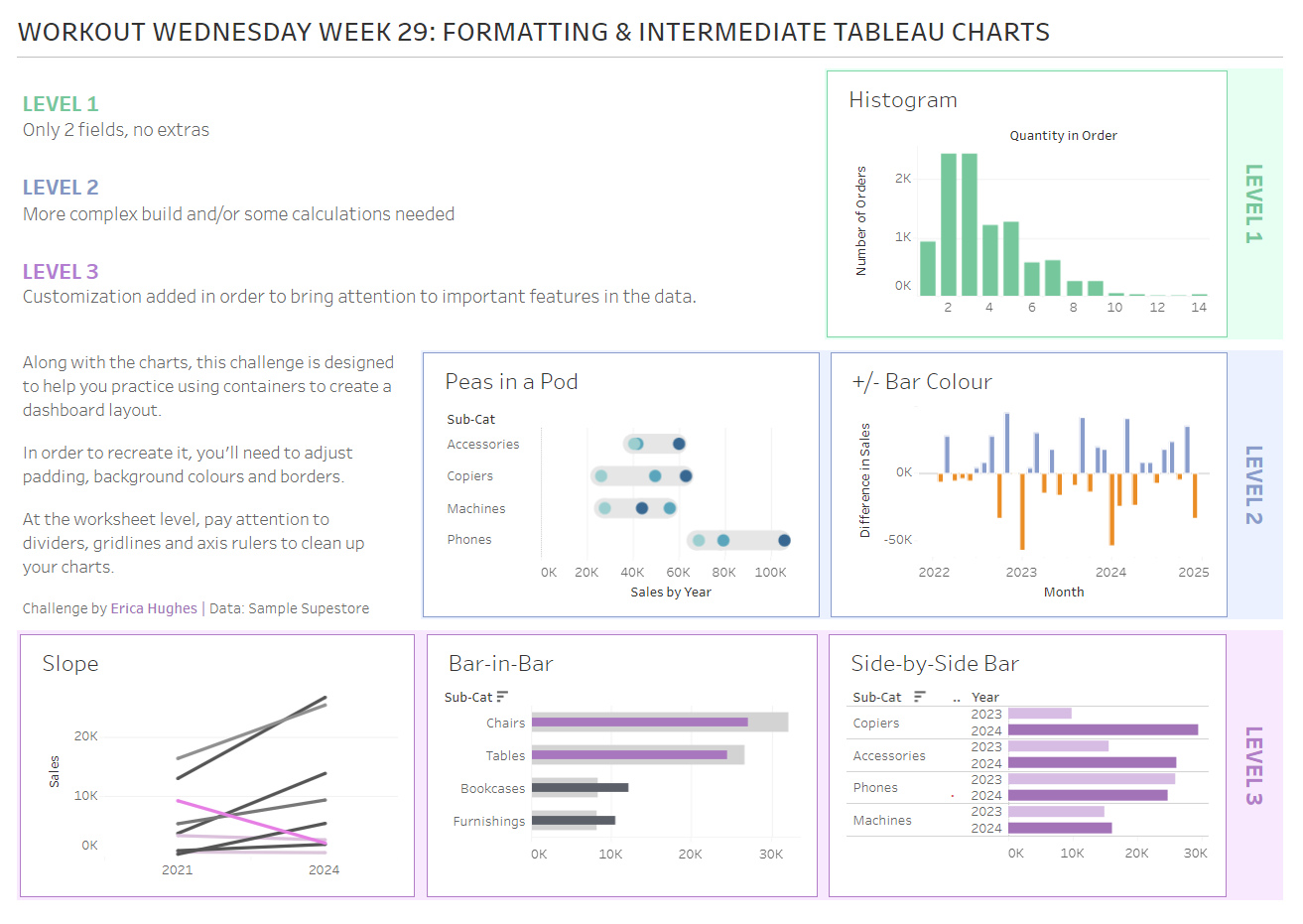
With that being said, my secondary goal for this week was to produce a challenge that might be accessible to a wider audience, so the focus is on building some intermediate Tableau charts and getting very familiar with using containers to create a more complex dashboard layout – the goal is to pay attention to details and strive to be pixel perfect with the design!
Requirements
- Dashboard size: 1200 x 850
- Create the charts – details are in the list below.
Each level was designed to be a little more complex than the previous one.
- Recreate the dashboard, following the layout, text, alignment and formatting (padding, background colours, borders) as closely as possible.
- You may choose your own colour schemes for each level, but I used green (#67c79c), blue (#879ccb) and pink (#b87dc7).
- Tidy up tooltips!
Level 1:
- A histogram that looks at how many orders had X number of products sold (defined by the Quantity measure)
Level 2:
- A “peas-in-a-pod” chart that looks at the Sales from 2022 to 2024 for the four Sub-Categories within the ‘Technology’ category.
- The change in Sales from month-to-month (for the years 2022 to 2024 only), with the negative changes highlighted with colour (I used orange).
Level 3:
- A slope chart of Sales by Sub-Category, filtered to Category = Office Supplies and Region = West. Colour the lines by the percent change in Sales between 2021 and 2024, making sure to highlight any steep decreases in Sales.
- A bar-in-bar chart that compares 2023 Sales (background light grey bars) to 2024 Sales (foreground darker bars) for each Sub-Category, filtered to Category = Furniture and Region = West. Use colour to highlight the Sub-Categories where the Sales decreased from 2023 to 2024.
- A side-by-side bar chart that compares 2023 Sales to 2024 Sales for each Sub-Category, filtered by Category = Technology and Region = West. Use an Indicator to highlight the Sub-Category where Sales decreased from 2023 to 2024.
Dataset
This challenge uses Sample Superstore data from 2024 (if you are using earlier versions of the data, you will need to shift the years that you are filtering by accordingly). You can find the data on Data.World.
Attribute
When you publish your solution on Tableau Public make sure to take the time and include a link to the original inspiration. Also include the hashtag #WOW2024 in your description to make it searchable!

Share
After you finish your workout, share on Twitter and/or LinkedIn using the hashtag #WOW2024 #Tableau and tag @WorkoutWednsday and @_hughej / Erica Hughes
Solution
Interactive