Introduction
This week’s challenge has 3 levels which I hope means there’s something for everyone – whether you’re new to Tableau and #WorkoutWednesday or a seasoned veteran 😉 If I’ve implemented things correctly, it should be possible to simply build on from the Beginner Level requirements without having to rework anything too much to get to the Intermediate and then Advanced Level challenges.
This week we’re looking at the performance of English Premier League football teams over the last 5 seasons. It includes data sourced from kaggle.com and shows matches from the start of the 2020/21 season up to the end of December 2024 (midway through the 2024/25 season)
Requirements
- Dashboard 1000 x 800
- 1 sheet
Beginner
- Pivot the data so there are 2 rows per match – 1 for the home team and 1 for the away team. You should end up with a column displaying the team and another displaying whether the team is the Home or Away team.
- Create a calculation to determine how many points the team gained in the match
- 3 points for the winning team
- 0 points for the losing team
- 1 point for each team if the result is a draw
- The FTR field will help with this – it displays H if the home team won, A if the Away team won or D if the match was a draw.
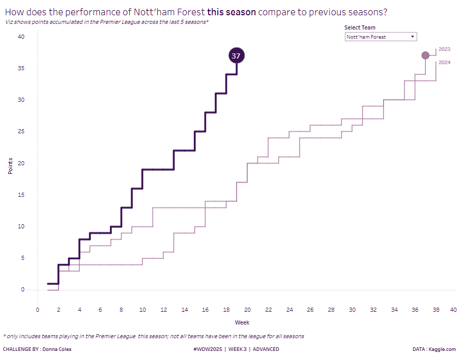
- Build a line chart that displays the number of points accrued within the season each week, for each team.
- Filter by Team, only allowing single selection and not allowing ‘All’ to be chosen.
- Format the line to be stepped and to be coloured and sized based on whether the year is the latest season or not (try not to hardcode the values)
- Colours used : dark purple (#3d1053), light purple (#b07aa1)
- Label the line with the (ending) season year and align middle right, matching the label colour to the line colour
- Match tooltips.
- Match formatting (all text is dark purple (#3d1053))
Intermediate
As above, but additionally
- Display the latest number of points for the latest week in the current season in a circular indicator.
- Indicate the first week in the previous seasons where the number of points accrued, was at least the same value or greater than the latest points for the current season (the number of points for the previous seasons should not be displayed in the mark label)
- For example, by week 19 of the 2024-25 season, Chelsea had accrued 35 points. In season 2021-22 they had accrued 33 points by week 21 (so less than 35 points) and 36 points by week 22 (more than 35 points). Week 22 needs to be highlighted, since that was the first week in that season they accrued at least 35 points.
- Ensure the size of the mark for the latest season is larger than the previous seasons (hint – you may want to create a duplicate instance of the pill you sized the line chart with, to ensure the line doesn’t become too thick).
- Don’t show the year label for the latest year.
Advanced
As above, but additionally
- Display in the tooltip of the circular marks for the previous seasons only, how many weeks more or less it took to accrue the points. The message should read
- Less: It took <insert number> weeks less to accrue at least the same number of points as the current season
- More: It took <insert number> weeks more to accrue at least the same number of points as the current season
- Same: It took the same amount of weeks to accrue at least the same number of points as the current season
- Only allow teams who are playing in the current season (2024/25) to be selectable in the filter.
Dataset
This challenge uses a custom data set originally sourced from kaggle.com which can be accessed from here.
Attribute
When you publish your solution on Tableau Public make sure to take the time and include a link to the original inspiration. Also include the hashtag #WOW2025 in your description to make it searchable!

Share
After you finish your workout, share on X and/or LinkedIn using the hashtag #WOW2025 #Tableau and tag @WorkoutWednsday
