Introduction
This week’s challenge is brought to you by a new guest coach, Kieran Adair. Kieran lives in Australia and has been working with Tableau for several years. He has been a long-time fan of Workout Wednesday and recently reached out to me with an idea for a challenge, which I thought you all might like.
Here is Kieran’s introduction to the task:
I want to start with a big thanks to the Workout Wednesday team for having me along this week for a guest challenge! This week’s challenge stems from a problem I’ve faced when building performance dashboards: how to best display ratio/average measures in their context. I’ll show you what I mean using data from Tableau’s Sample Superstore…
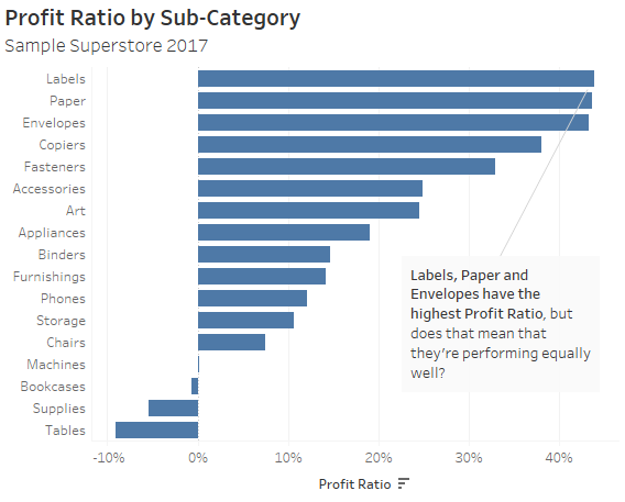
Simply displaying an average like Profit Ratio by Product Sub-Category may lead to misleading comparisons if the number of sales differ significantly across product categories:
One way to resolve this issue is adding a second chart which displays the underlying volume (in this case Sales):
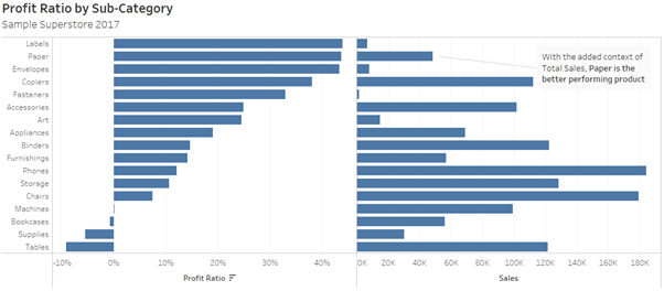
But when working within the constraints of a dashboard, additional space is often a luxury Tableau developers can’t afford.
This solution has an additional drawback: having two graphs side-by-side provides no visual hierarchy to direct the user toward which measure is more important. Instead, the user must shift their eyes back and forth across the screen between the two.
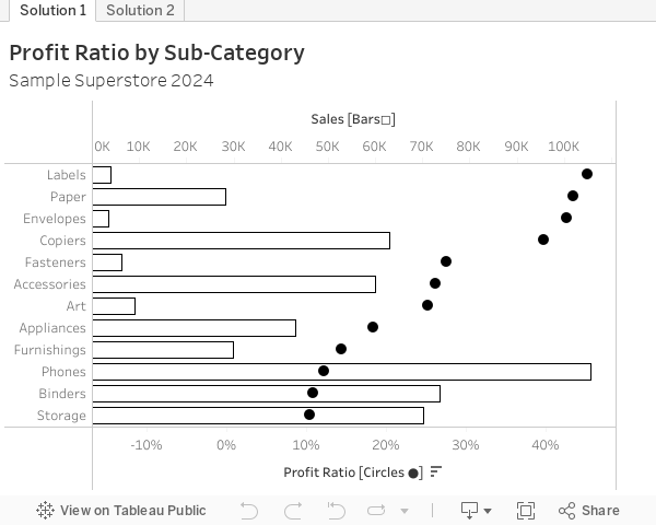
This week’s challenge is to recreate a solution to this problem I’ve found useful when developing performance dashboards: the dual-axis dot plot and bar chart, or as I like to call them Ratio And Volume Ensemble (RAVE):
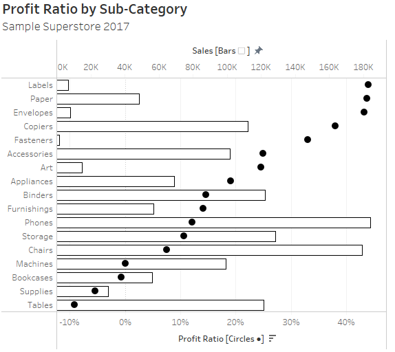
This combination of dot plot and bar chart, used for the ratio and volume measures respectively, is a powerful way to display these two measures together in a way that’s space efficient and doesn’t require users to shift their eyes between multiple charts.
Additionally, the use of filled colour for the ratio measure pre-attentively focusses the user on the key metric (in this case Profit Ratio) – while letting them look deeper into the graph if they need to view the underlying Volume (Sales).
Using a dot plot, instead of a bar chart, for the ratio has an additional benefit. Because a dot plot is based on relative position, rather than length or width, it isn’t tethered to a zero-based axis. This makes it is better at presenting comparisons between values whose distribution are both positive and negative (as in the case above) or closely clustered together.
On the other hand, it can be assumed that volume-based metrics will only be positive – and imperceptible differences between two bars widths will still provide adequate context to understand the ratio measure.
(For a further guide to bar charts, dot plots and more, I highly recommend Stephen Few’s excellent book ‘Now You See It: An Introduction to Visual Sensemaking’, from which the last two paragraphs are paraphrased).
Requirements
- On a single sheet, Ratio And Volume Ensemble (RAVE chart) showing Profit Ratio and Total Sales by Product Sub-Category for 2024
- Present Profit Ratio as a Dot Plot on the bottom axis
- Set the colour to black and filled
- Add the subtitle ‘Circles ●’ to the axis label as a guide for the user
- Present Sales as a Bar Chart on the top axis
- Set the colour to white, opacity to 0%, and border to black
- Add the subtitle ‘Bars◻’ to the axis label as a guide for the user
- Set the axis start to zero
- Ensure Dot Plot is on the front
- Hide all grid lines and zero lines from the chart
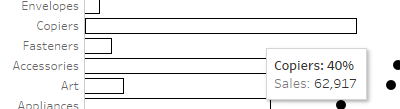
Add a tooltip so that the first line is “[Sub-Category]: [Profit Ratio]” (bold) and second line is “Sales: [Sales Amount]”:
The ● and ◻ icons are both altcodes. These (along with emojis) can be accessed, and used in Tableau, in Windows by pressing Windows Key + . (full stop) and on Apple by pressing Command + Control + Spacebar.
- Introduce a time comparison for both the Profit Ratio and Sales by adding 2023 data to the view:
- Add a second grey dot to the dot plot for the Profit Ratio of 2023
- Add a reference line to the bar chart showing Sales by Product Sub-Category for 2024
- Format the tooltips so all this information is visible
Dataset
This challenge uses Sample Superstore data (2024 version) with no filters applied. You can find the data source on Data.World
Attribute
When you publish your solution on Tableau Public make sure to take the time and include a link to the original inspiration. Also include the hashtag #WOW2025 in your description to make it searchable!

Share
After you finish your workout, share your solution:
- On Twitter using the hashtag #WOW2025 #Tableau and tag @WorkoutWednsday, @KieranAdair_ and @_hughej
- On LinkedIn using the tag Workout Wednesday, Tableau, Kieran Adair and Erica Hughes
Solution
Interactive