Introduction
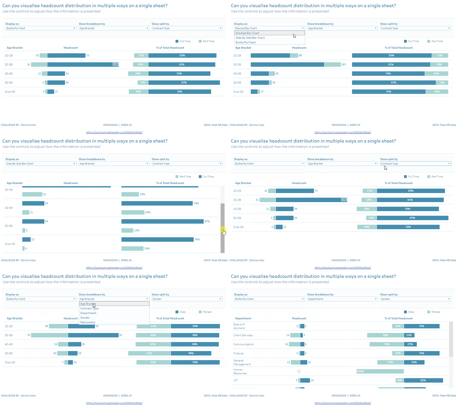
For this week’s challenge I want to see if you can provide users with the flexibility to choose how they want to display a particular metric – in this case we’re looking at Headcount data, and how it is distributed across different employee attributes. Depending on the question being asked, a particular layout might provide a better answer.
Requirements
- Dashboard 1000 x 600
- Allow users to select a different chart type from one of Butterfly Chart, Stacked Bar Chart or Side by Side Bar Chart
- Allow users to select which attribute to breakdown for each row – Age Bracket, Contract Type, Department, Gender, Nationality
- Contract Type is either Full Time or Part Time. An employee is a full time employee if their FTE (full time equivalent) value is 1
- Age Brackets are Under 20, 20-29, 30-39, 40-49, 50-50 and Over 60.
- Age should be calculated in whole years based on the employee’s Birth Date and ‘Today’.
- For the purposes of this viz (and the data provided), assume ‘Today’ is 01 Dec 2022, so be mindful of how old someone, whose birthday is in December, should be.
- Allow users to select which attribute to split each row by – Gender or Contract Type or neither
- Display both actual headcount and % of total (for the row)
- When displaying a butterfly chart ensure Females / Part Time is displayed on the left side of both charts.
- Match the positioning of the labels.
- Match tooltips.
- Colour as you choose – I used #358ead and #a1d5d2
Dataset
This challenge uses a custom fabricated data set extended from the HR data available from the Real World Fake Data initiative (#RWFD), and is available from here.
Attribute
When you publish your solution on Tableau Public make sure to take the time and include a link to the original inspiration. Also include the hashtag #WOW2024 in your description to make it searchable!

Share
After you finish your workout, share on Twitter and/or LinkedIn using the hashtag #WOW2024 #Tableau and tag @WorkoutWednsday
