Introduction
Welcome to Week 42!
This week we’ll look at an easy way to compare data year over year, whether we are using a line chart visualization or a pivot table to view our data. There are many ways to acheive similar results, this is just one! Feel free to play around with other ways to analyze the data year over year.
The formatting styles and colors in this challenge are all up to you. Try to make the report easy to read, with the important data popping!
Have fun!
Need access to Sigma?
Note: You will only have view access to WOW Workbooks, Folders, and Workspaces, not edit access. Please create your WOW Workbooks under “My Documents.” We suggest creating a folder to organize all your workbooks.
Requirements
- Add data table element from TASTY_BYTES_FOOD_TRUCKS schema
- Sigma Sample Database > Retail > TASTY_BYTES_FOOD_TRUCKS
- FCT_DAILY_ORDER_PROFIT – has daily order information
- Create a child element with the Order date, Total Sales, Total COGs, Total Profit
- Create three calculated columns. One for the order year, one for the order month name, and one for the order month number. ex. [2024] [January] [1]
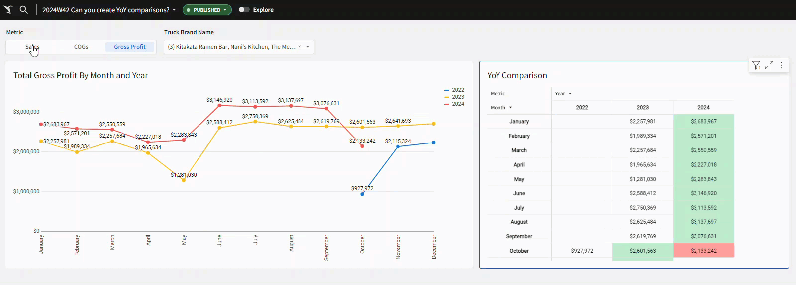
- Create a child pivot table with the month name in the rows, sorted by the month number, and the year in the columns.
- Create a segmented control with the options: Sales, COGs, Gross Profit
- Use a switch function in your pivot table values to display the total sales, cogs, or gross profit depeneding on what is selected in the new segmented control.
- Add conditional formatting as follows: If the value is greater or equal to the value from last year in the same month, highlight the cell green. If the value is lower, highlight the cell red. Hints: use two conditional formatting rules, and the lag() function.
- Format the table as presentation table style, with the values centered.
- Create a child viz element – a line graph
- Month name in the X-Axis (sorted by the month number – use custom sort and aggregation min), Metric column in the Y-axis, and year in the colors.
- Add points and Data labels do your graph, and rename it to have a dynamic title based on the selected metric.
- Add a page control for the Truck Brand Name that effects both the table and the graph, default to Nani’s Kitchen, Kitikata Ramen Bar, and The Mega Melt.
- Move your data table into a hidden tab, put the elements side by side in your main tab with the controls on top of the page.
- Add data table element from TASTY_BYTES_FOOD_TRUCKS schema
- Add any additional formatting you’d like, and don’t forget to share your solution!
Dataset
Sigma Sample Database > Retail > TASTY_BYTES_FOOD_TRUCKS
Share
After you finish your workout, share on LinkedIn, Sigma’s Community page, (or Twitter) using the hashtags #WOW2024 and #SigmaComputing, and tag Ashley Bennett, Eric Heidbreder, Katrina Menne, and Michal Shaffer!
Create an interactive, sharable version of your solution here.
Also, make sure to fill out the Submission Tracker so that we can count you as a participant this week to track our participation throughout the year.