Introduction
Welcome to Week 2 of 2025!
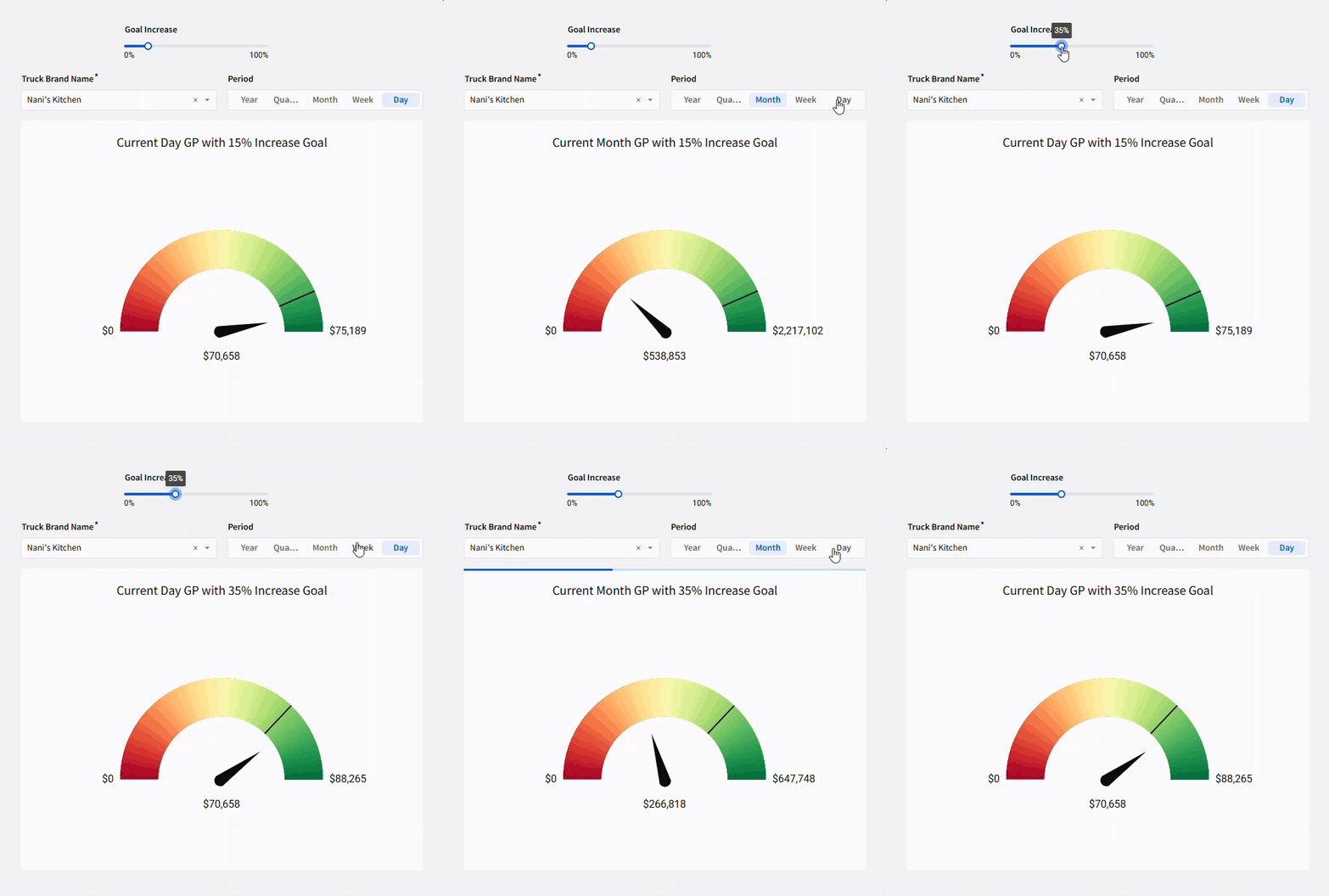
Sometimes it’s nice to have a really quick visual of how things are going in your business. Sometimes a line or bar chart shows you what you need, but I recently found that gauges are exactly what I need! This week let’s play with using a gauge to see how our current profits are doing.
The formatting styles and colors in this challenge are all up to you. Try to make the report easy to read, with the important data popping!
Have fun!
Need access to Sigma?
Note: You will only have view access to WOW Workbooks, Folders, and Workspaces, not edit access. Please create your WOW Workbooks under “My Documents.” We suggest creating a folder to organize all your workbooks.

Requirements
- Add data table element from TASTY_BYTES_FOOD_TRUCKS schema
- Sigma Sample Database > Retail > TASTY_BYTES_FOOD_TRUCKS
- Group the FCT_DAILY_ORDER_PROFIT table
- Level 1: Truck Brand Name
- Level 2: Order Date
- Level 2 Calc: Total Gross Profit
- Level 1 Calc:
- Total Gross Profit current period (hint: use sumif() and date_trunc())
- Total Gross Profit previous period (hint: use sumif(), date_add, date_trunc)
- Create a segmented control with date parts and update the order date grouping to use the control value
- Create a page control for the Truck Brand Name. The control should be required and not allow multiple selection. Default to ‘Nani’s Kitchen’.
- Add a slider control using Percent format, from 0 to 100% (hint: max will be 1 instead of 100, step should be in decimal form as well)
- Call this slider the ‘Goal Increase’ – it will be the percentage increase your profit goal is from the previous period.
- Add a new calc in Level 1: Previous Period + Goal Increase (hint: you need to calculate the increase, you don’t want to just add the flat decimal value.) Call this column ‘Max’.
- Create a gauge viz as a child element of your table, using the Max column as your max, the previous period GP as the target, and the Current GP as the value.
- Format the colors to show a red-yellow-green scale.
- Rename the visualization to use dynamic text: ‘Current [period] GP with [goal increase]% Increase Goal’
- Finally, move your data table into a hidden tab, move the gauge and controls around to look nice on the page.
- Add data table element from TASTY_BYTES_FOOD_TRUCKS schema
- Add any additional formatting you’d like, and don’t forget to share your solution!
Dataset
Sigma Sample Database > Retail > TASTY_BYTES_FOOD_TRUCKS
Share
After you finish your workout, share on LinkedIn, Sigma’s Community page, (or Twitter) using the hashtags #WOW2024 and #SigmaComputing, and tag Ashley Bennett, Eric Heidbreder, Katrina Menne, and Michal Shaffer!
Create an interactive, sharable version of your solution here.
Also, make sure to fill out the Submission Tracker so that we can count you as a participant this week to track our participation throughout the year.