Can you make a bump chart?
Introduction
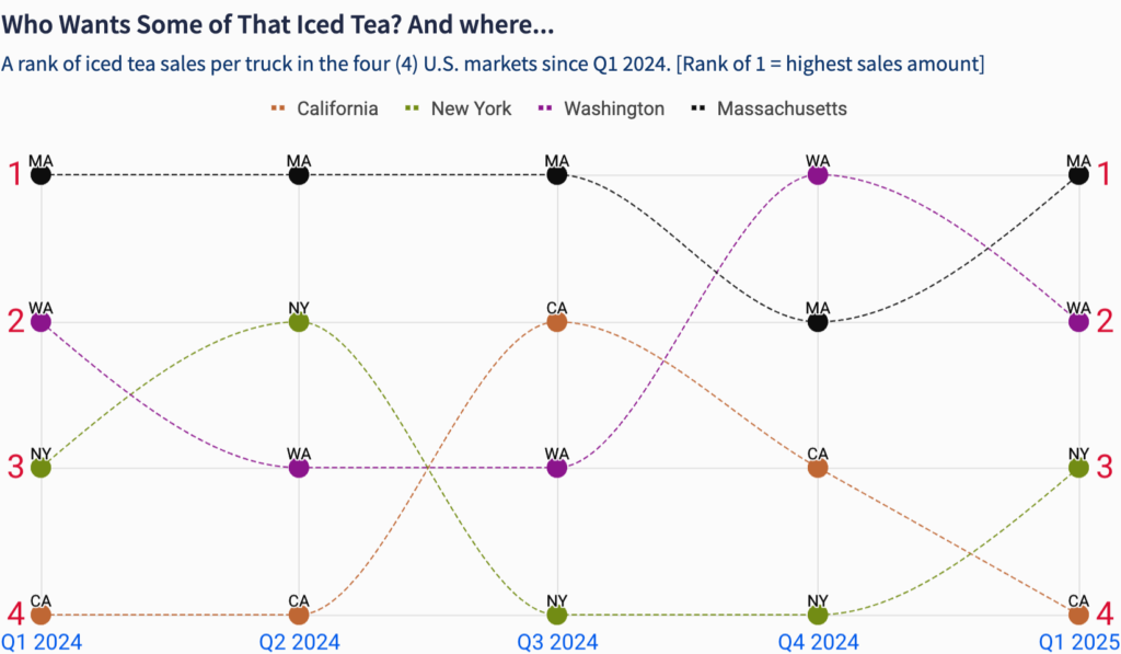
Bump charts are a great way explore changes in rank over time. They’re also a snazzy way to gamify your data and create some friendly competition. A bump chart is more interactive with a continuous time field – the chart changes when a new date part occurs.
We’ll use some of Sigma’s enhanced chart formatting to jazz things up a bit.
Enjoy!
Carter
Need Access to Sigma?
Click here to sign up
Link to Sigma WoW Instance
Click here to Watch: How to Register & Get Started with Sigma WoW
Note: You will only have view access to WOW Workbooks, Folders, and Workspaces, not edit access. Please create your WOW Workbooks under “My Documents.” We suggest creating a folder to organize all your workbooks.
Click to Open an Interactive Workbook
Requirements
- Create one bump chart to rank sales over time for a specific menu item, per unique food truck & state
- Filter the data for California, New York, Washington, and Massachusetts
- Calculate the per-truck sales amount
- Rank the sales by amount (desc) per state and quarter
- Hint: Make sure to choose a chart that lets you combine or layer different visuals
- Pick any color palette you feel great about!
- Label the line points by abbreviated State name
- Match other chart designs for gridlines and titles
Dataset
SIGMA SAMPLE DATABASE:
RETAIL/TASTY_BYTES_FOOD_TRUCKS/FCT_ORDERS
Share
After you finish your workout, share on LinkedIn, Sigma’s Community page, (or Twitter) using the hashtags #WOW2024 and #SigmaComputing, and tag Ashley Bennett, Eric Heidbreder, Katrina Menne, Carter Voekel, and Michal Shaffer!
Create an interactive, sharable version of your solution here.
Also, make sure to fill out the Submission Tracker so that we can count you as a participant this week to track our participation throughout the year.
Solution
Coming soon…