Introduction
It’s Community Month once again, which means we have a series of guest coaches creating challenges for you over the next few weeks. This week’s challenge creator is relatively new to Workout Wednesday, but is a prominent member of the wider Tableau community, having been awared 2x VOTD and nominated as Datafam Rising Star in 2025. It is with great pleasure that I introduce you to Anna Clara Gatti.
Anche se partecipo alle sfide di #WorkoutWednesday solo dall’inizio di quest’anno, mi hanno già insegnato tante cose nuove e sono quindi molto contenta di avere l’opportunità di crearne una mia!
Io ho una formazione in statistica demografica e anche se ora per lavoro mi occupo di altro, continuo a interessarmi alle dinamiche della popolazione e a come i cambiamenti demografici influenzino la società.
Per questo, quando Erica mi ha chiesto se volessi creare una sfida per il Community Month, ho subito pensato a una piramide delle età, uno dei miei cavalli di battaglia!
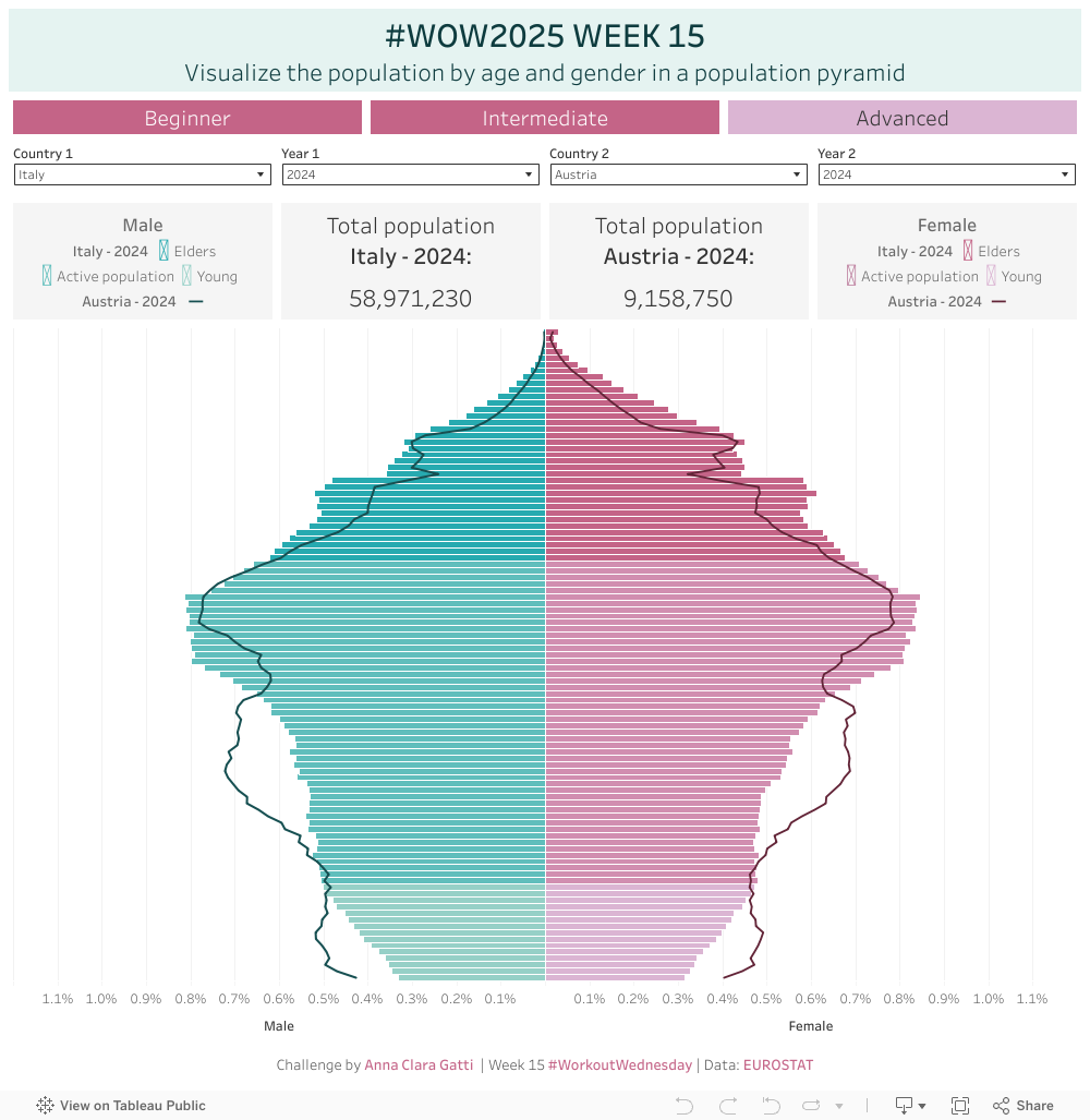
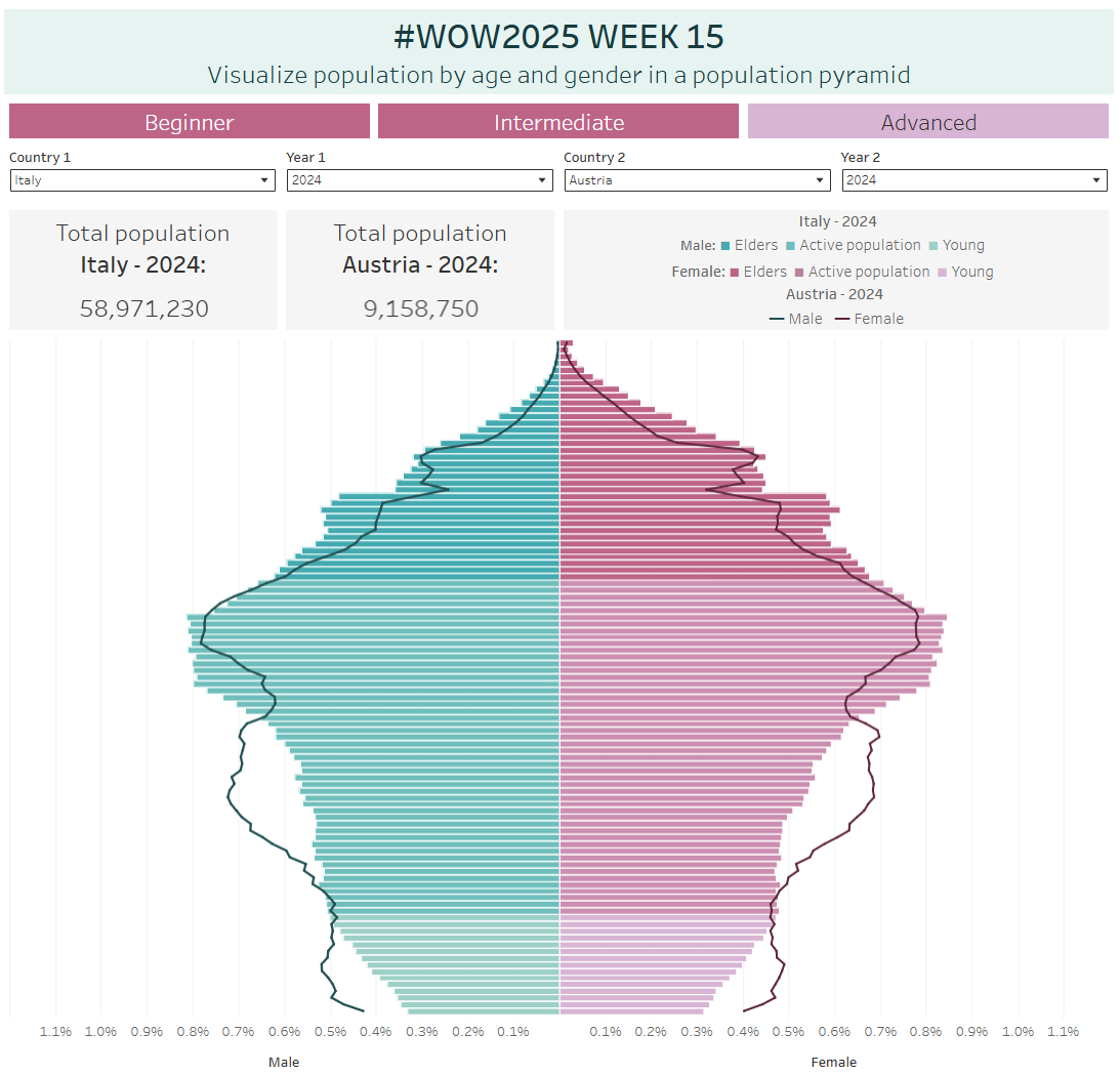
Una piramide delle età è una visualizzazione che mostra la distribuzione della popolazione per età e genere, utilizzata per analizzare fenomeni demografici come l’invecchiamento, la composizione della forza lavoro e il potenziale di crescita futura. L’obiettivo di questa sfida è creare una visualizzazione per confrontare le strutture demografiche di diversi paesi nel tempo.
Utilizzeremo i dati di EUROSTAT per esplorare la popolazione dei paesi dell’Unione Europea tra il 2015 e il 2024.
Ho strutturato la sfida in tre livelli, in modo che sia accessibile sia a chi è alle prime armi sia a chi ha già esperienza e vuole mettersi alla prova con una visualizzazione più avanzata. Spero che vi piaccia e non vedo l’ora di scoprire come l’affronterete!
Although I’ve been participating in #WorkoutWednesday challenges only since the beginning of this year, it has already helped me learn so many new things. That’s why I’m thrilled to have the opportunity to create my own challenge!
I have background in demographic statistics and although my work now focuses on other areas, I still enjoy exploring population dynamics and how demographic changes impact society.
So, when Erica asked if I’d like to design a challenge for Community Month, I immediately thought of a population pyramid, one of my signature vizzes!
A population pyramid is a powerful way to visualize the distribution of a population by age and gender. It’s often used to analyze demographic trends such as population aging, workforce composition, and future growth potential. The goal of this challenge is to create a visualization to compare population structures across multiple countries and over time.
For this challenge, we’ll be using EUROSTAT data, allowing us to explore the population structures of the European Union (EU) countries from 2015 to 2024.
I’ve structured the challenge into three levels to make it accessible for beginners while also providing a challenge for more advanced participants who want to take their visualization to the next level. I hope you like it, and I can’t wait to see how you tackle it!
Requirements
Livello 1 / Prncipiante
- Dashboard 1000 x 1000
- Due fogli di lavoro:
- Uno per la piramide per età, che sostanzialmente è realizzata con due grafici a barre sui lati opposti dello stesso asse y
- Visualizza il valore percentuale sul totale della popolazione per ciascuna combinazione di genere ed età.
- Assicurati che l’asse dei maschi e quello delle femmine siano simmetrici
- Nel tooltip, inserici sia il valore percentuale che il valore assoluto
- Aggiungi la legenda, puoi crearne una personalizzata o usare quella di default
- Il secondo deve mostrare il totale della popolazione
- Uno per la piramide per età, che sostanzialmente è realizzata con due grafici a barre sui lati opposti dello stesso asse y
- Permetti di filtrare per nazione e anno
- Usa i colori che preferisci, io ho usato:
- #27aab0 per i maschi
- #c46487 per le femmine
Livello 2 / Intermedio
In aggiunta al livello precedente:
- Colora la piramide per età con colori differenti, a tua scelta, in funzione dell’età della popolazione divisa nei tre gruppi che sono la base del calcolo di molti indici demografici:
- Giovani, fino a 14 anni (#96d0c7 maschi – #dbb5d3 femmine)
- Popolazione attiva, tra i 15 e i 64 anni (#60bebc – #d18eb0 femmine)
- Anziani, 65 anni e più (#27aab0 maschi – #c46487 femmine)
- Non utilizzare la funzione di raggruppamento di Tableau per creare i tre gruppi
- Aggiungi nel tooltip l’indicazione del gruppo
- Usa una legenda personalizzata che non ripeta maschi/femmine per tutte le categorie
Livello 3 / Avanzato
In aggiunta al livello precedente:
- Permetti il confronto tra due nazioni, o tra la stessa nazione in due anni differenti sovrapponendo alla piramide per età un line chart con colori differenti a tua scelta per maschi e femmine (#175052 maschi – #632538 femmine)
- Aggiungi un ulteriore foglio di lavoro con la popolazione totale della seconda nazione/del secondo anno
- Aggiungi anche le informazioni del line chart alla legenda
- Formatta i tooltip in modo che le informazioni per le due nazioni/i due anni per l’età selezionata siano visibili
Se decidi di provare più livelli della sfida e pubblicarli tutti, scegli il modo che preferisci per consentire il passaggio da uno all’altro. Io ho utilizzato i pulsanti di navigazione, ma si possono sia la visualizzazione dei fogli come schede (impostazione predefinita in Tableau) che altri metodi, come ad
Level 1 / Beginner
- Dashboard 1000 x 1000
- Two sheets:
- One for the population pyramid, which is in essence two bar charts on either side of the same y-axis
- Display the percentage value of the total population for each gender and age combination
- Ensure that the male and female axes are symmetrical
- In the tooltip, display both the percentage value and the absolute value
- Add a legend, either a custom one or the default
- The second sheet should show the total population
- One for the population pyramid, which is in essence two bar charts on either side of the same y-axis
- Allow filtering by country and year
- Use the colors you prefer, I used:
- #27aab0 for males
- #c46487 for females
Level 2 / Intermediate
In addition to the previous level:
- Color the population pyramid using different colors of your choice based on the age groups that are fundamental for many demographic indicators:
- Young, up to 14 years old (#96d0c7 males – #dbb5d3 females)
- Active population, between 15 and 64 years old (#60bebc males – #d18eb0 females)
- Elders, 65 years and older (#27aab0 males – #c46487 females)
- Don’t use Tableau’s grouping function to create the three age groups
- Add the age group indication in the tooltip
- Use a custom legend that does not repeat male/female for every category
Level 3 / Advanced
In addition to the previous level:
- Allow comparison between two countries or between the same country in two different years by overlaying a line chart on the population pyramid, using different colors of your choice for males and females (#175052 for males – #632538 for females)
- Add an additional worksheet displaying the total population of the second country/year
- Add the line chart information to the legend
- Format the tooltips so that all information for both countries/years for the selected age is visible
If you decide to try multiple levels of the challenge and publish them all, choose the way you prefer to allow navigation between them. I used navigation buttons, but you can also decide to show viz sheets as tabs (the default setting in Tableau) or other methods, such as Dynamic Zone Visibility
Dataset
Scarica/Download the data here.
Attribute
When you publish your solution on Tableau Public make sure to take the time and include a link to the original inspiration. Also include the hashtag #WOW2025 in your description to make it searchable!
Share
After you finish your workout, share on Twitter and/or LinkedIn using the hashtags #WOW2025 #Tableau and tagging:
On LinkedIn: Anna Clara Gatti, Erica Hughes & Workout Wednesday
On Twitter: @AnnaClaraGatti, @_hughej & @WorkoutWednsday
Solution
Interactive