Introduction
🎉 Happy Workout Wednesday, data fam! 🎉
I’m thrilled to be back with another Power BI challenge—and this one is all about taking something simple and pushing it to the NEXT level! 💪
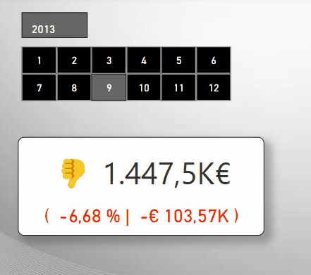
Cards are often the go-to for showing big, bold numbers. But what if we could make them smarter?
More informative, expressive, and even a little bit fun? 🤩
This week, your challenge is to level up the humble Power BI Card by:
-
Adding variance labels to show how metrics compare to targets 📊
-
Including emojis to intuitively signal performance 📉
-
Creating a clean, sleek layout that instantly communicates status at a glance 🔍
Whether it’s sales performance, website traffic, or customer satisfaction—let’s make those KPIs pop and tell a story without needing a single extra click!
I’m super excited to see your creative takes on this challenge. Let’s turn those plain old cards into something fun-tastic 💫
Ready? Set? CARDify!
P.S. I’m sorry for all the wordplay 🤣 but I couldn’t resist!

Requirements
- Open the starter file that contains the data you’ll need for this challenge.
- Create 6 measures:
- Revenue
- Revenue month over month
- Percent change in revenue from previous month to current month
- Variances label that includes thumbs up/down emojis
- Difference in revenue month over month
- Formatting for text color (up vs down)
- Add a slicer visual to the canvas using the month value
- Plot a card visual and format:
- Callout value using your formatting for text color measure
- Subtitle
- Background
Dataset
Data for this challenge can be downloaded. There are 3 tables needed for this exercise: Date, FactSales, and DimSalesTerritory.
Share
After you finish your workout, share on social media using the hashtags #WOW2025 and #PowerBI. You’re welcome to tag the author(s) on LinkedIn! [Kathrin Borchert]
On Bluesky, tag @mirrortears.bsky.social, @mmarie.bsky.social, @shan-gsd.bsky.social, and @merrykerry.bsky.social.
Solution
Download the solution file.