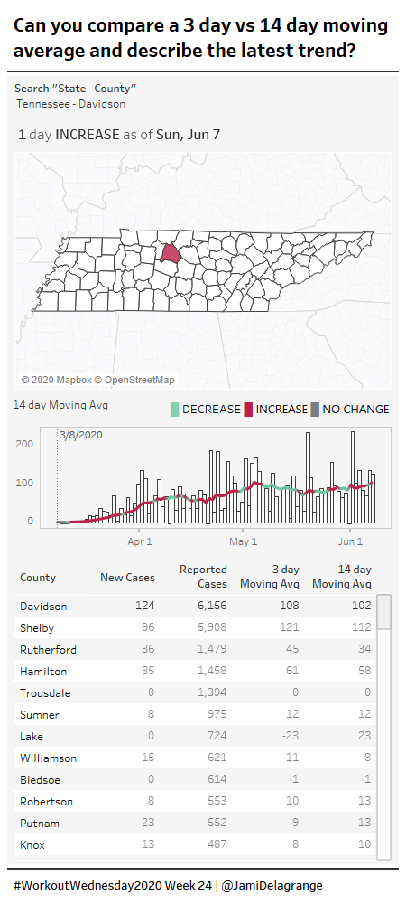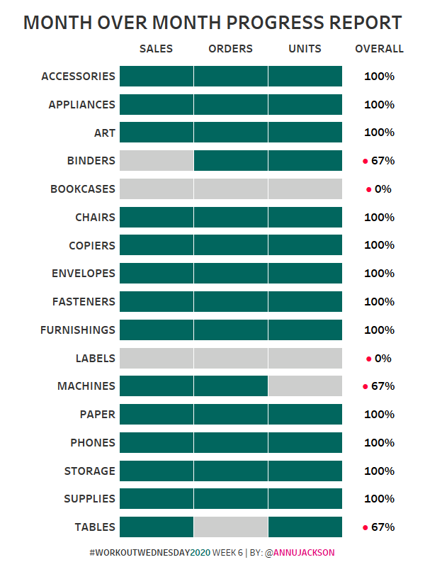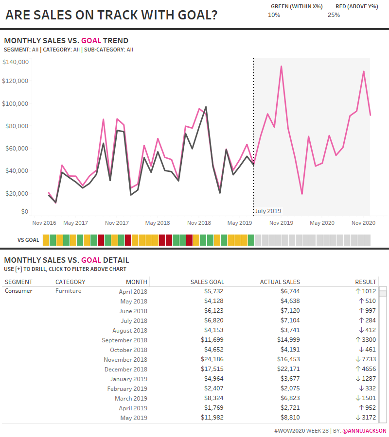
2020 Week 28: Are Sales on Track with Goal?
Introduction Congratulations! We are now halfway through 2020 – it’s been a remarkable year, certainly full of twists, turns, and the unexpected. The purpose of this week’s challenge is to demonstrate how a metric compares to a goal. Like most goal data I encounter, the sales goals for this challenge don’t reside in the same …