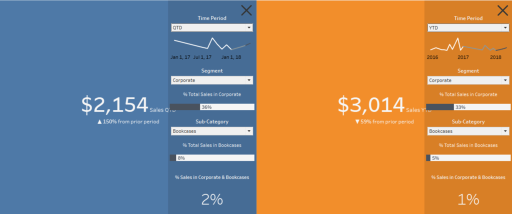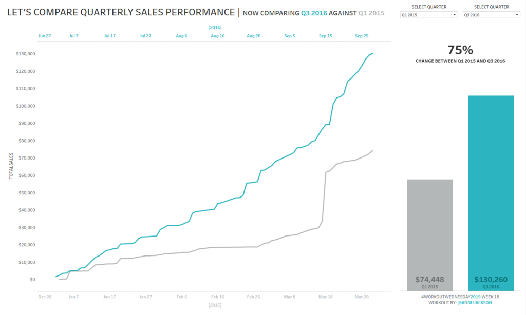
Week 42: Can you build a comparative line chart with dynamic inputs?
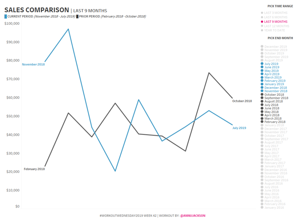
This week’s challenge is taken directly from a situation I recently had on a project. The goal of the project was to be able to isolate out time periods of a specific length and compare it to the time period directly before it. So as an example, if it’s October 2019, I want to look …
Week 42: Can you build a comparative line chart with dynamic inputs? Read More