2021 Week 26 – Tableau: Profitability with Dual Axis Charts
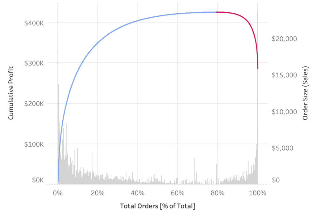
Introduction This week we are going to do two things: look at alternative for the most common scatterplot I see in Tableau. use a very uncommon unsynchronized dual axis chart. First, the chart I always run into is this scatterplot of total sales and total profit by order. While we can see which orders were …
2021 Week 26 – Tableau: Profitability with Dual Axis Charts Read More »