2025 Week 31 | Sigma: Can You Pick a Park?
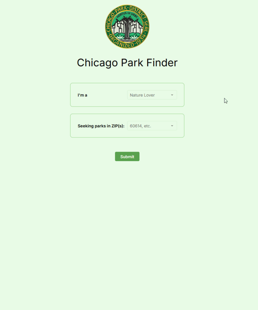
Introduction Living in Chicago, one of my favorite things to do is visit parks. Some are small, some are gigantic, and it’s often that I don’t really know all the options my local parks have to offer. I wanted to build this quick app off of Chicago Parks District data to help find parks near …