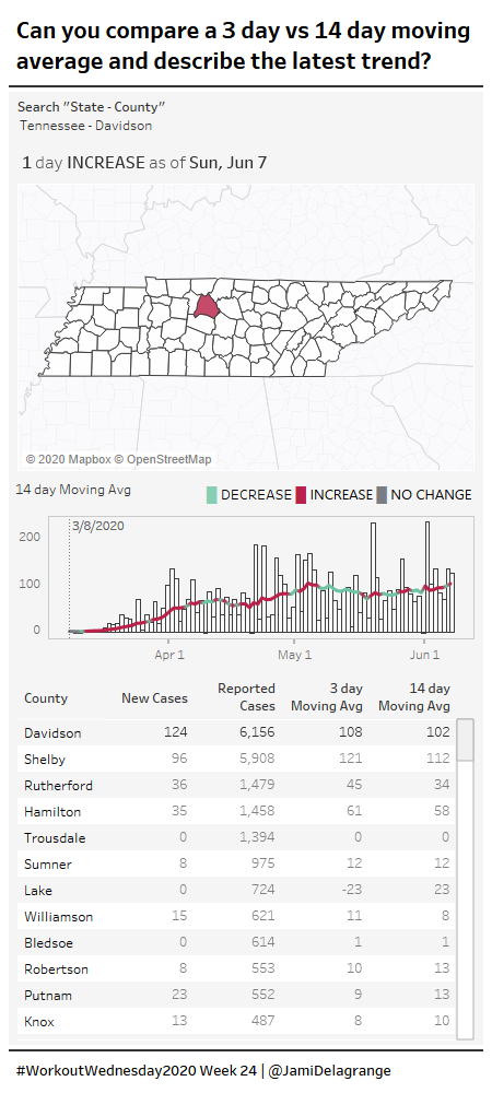
2019 Week 49: Can you swap states?
2019 Week 49: Can you swap states? Read More »
How much information have you retained from Tableau Conference 2019? Are you still watching session videos (like I am?). This challenge is an homage to the amazing conference from this year. The challenge comes from something I encountered in a recent work situation. The end-user wanted to be able to automatically group together small contributing
Week 48: Can you build a Bar Chart that automatically combines small contributions? Read More »
This week I wanted to try and keep things simple. I wanted to show how to build a high level dashboard and use the new feature of explain data to produce another. Requirements Dashboard Size 1000 x 800 3 Sheets on first dashboard, 2 auto created sheets on the second Sub Category Sales by
#WorkoutWednesday2019 Week 47 – High Level Dashboard with Explain Data Read More »
This is a special week for Workout Wednesday, as we are running this challenge live from Tableau Conference in Las Vegas! We’ve put together a challenge this week that is simple enough for someone who is just getting started with Tableau, tricky enough for those further along in their Tableau journey, and a great teaching
2019 Week 46: Can you build a dynamic scatter plot with proportional brushing? Read More »
Have you been participating in our challenges and want to take it to the next level? Perhaps you’ve never participated, but have always wanted to share analytics problems with others. Either way, now is your chance! We’ve seen firsthand the impact that being a part of Workout Wednesday has had on various community members, helping
Call for 2020 Contributors! Read More »
For this week’s challenge I was working on our own internal dashboards trying to show progress to a series of targets and landed on the this week’s challenge! This one combines my favorite chart type: the donut chart with the humble checkmark. – LS Challenge Click image to view on Tableau Public Requirements Format: 800px
2019 Week 45: What is our daily fulfillment rate by region? Read More »
This week’s workout comes from a recent conversation I had. The goal was to figure out the best periods of sales (whether that was best days, best weeks, or best months) and to understand more context around those dates. Was the increase in sales driven by holidays or other external events, or perhaps it was
Week 44: Can you build a Sales Calendar with top 3 highlighting? Read More »
We are on the home run for #Data19, so what better way that to map all the casinos around Mandalay Bay? This week we take a few new features and plot them onto a mobile friendly dashboard. Requirements Dashboard Size 350 x 800 Input custom number of miles Create Map showing selected casino and all
Week 43: Show me all the casinos within X miles of X casino by metres Read More »
This week’s challenge is taken directly from a situation I recently had on a project. The goal of the project was to be able to isolate out time periods of a specific length and compare it to the time period directly before it. So as an example, if it’s October 2019, I want to look
Week 42: Can you build a comparative line chart with dynamic inputs? Read More »
Once again, this week comes from a real life challenge. This real-life scenario involves a scatterplot of customers and a long, long table. The first requirement was to keep all the customers in the list, but also highlight those customers. After a round of feedback our stakeholder decided they wanted the selected customers to “surface
2019 Week 41: Which customers are costing us? Read More »