 Happy Workout Wednesday, data fam!
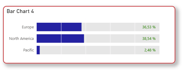
This week, we’re taking bar charts to the next level—with built-in scales that visually speak for themselves! 
We all love a good bar chart, but sometimes you want to show progress toward a goal or segment values into performance zones – without extra visuals, DAX trickery, or custom backgrounds. Just pure, native Power BI. 
Your challenge: Create a bar chart with a visual scale using X-Axis constant lines 
 Use constant lines to create a grid layout that feels like a progress bar Make it intuitive—like a KPI meter that shows how far we’ve come Add smart touches like % labels or conditional colors for extra clarity
Whether you’re tracking sales, quotas, or survey results, this technique adds depth and context at a glance—and it looks super sleek too! 
Let’s raise the bar (literally) and build visuals that guide the viewer’s eye effortlessly.
Ready? Set? SCALE it up! 
- Open the starter file that contains the data you’ll need for this challenge. (We will reuse the file from week 16)
- Create +1 measures:
- 100% = 100
- Plot a clustered bar chart visual and format:
- Hint: you need to overlap the bars

- Hint: you need to overlap the bars
- Add the x-axis constant lines to your visual