DAX

Workout Wednesday Power BI Week 23 2021 Nobel Prize

2021 Week 23 | Power BI: Can You Build a Cumulative Line Chart?

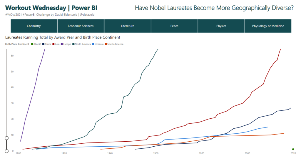
Introduction Continuing with the Nobel Prize data that Meagan began exploring last week, this week extends to consider aspects of individual Nobel laureates. The main visual is a cumulative line chart, but you’ll also provide detail on laureates with a report page tooltip. While additional JSON expansion and transformation was required from the original dataset, …

2021 Week 23 | Power BI: Can You Build a Cumulative Line Chart? Read More

2021 Week 22 | Power BI: Create Your Own Timeline from JSON Data

Introduction Workout Wednesdays for Power BI is now in our sixth month! Thanks so much for joining us. For the month of June, we will have independent exercises that all use the same data source but focus on different aspects of the data and of Power BI. Our dataset for the month comes from Nobelprize.org. …

2021 Week 22 | Power BI: Create Your Own Timeline from JSON Data Read More

2021 Week 21 | Power BI: Time Intelligence

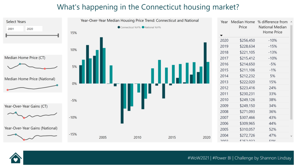
Introduction The Power BI Workout Wednesday team has decided that May is made for DAX! Each challenge this month will require some DAX in the solution. For this week’s solution we are going to practice DAX time intelligence functions, looking at the housing market in the US state of Connecticut. Time intelligence functions allow you to …

2021 Week 21 | Power BI: Time Intelligence Read More

Start Screen for the Cat or Croissant Game

2021 Week 18 | Power BI: DAX Trick – Cat or Croissant

Introduction The Power BI Workout Wednesday team has decided that May is made for DAX! Each challenge this month will require some DAX in the solution.  We are going to start our month of DAX with a fun game called Cat or Croissant. You might be familiar with the many versions of “animal or food” …

2021 Week 18 | Power BI: DAX Trick – Cat or Croissant Read More

2021 Week 8 | Power BI: SWITCH()ing Measures

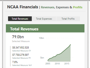
Introduction Thanks to everyone who has ben participating in #WorkoutWednesday – Power BI edition. This week we are going to be diving into switching metrics in your reports using SWITCH() and a slicer. This method can be especially useful when designing reports for mobile use. Toggling between metrics allows you to save real estate on …

2021 Week 8 | Power BI: SWITCH()ing Measures Read More

Scroll to Top