#WOW2025 Week 26: Can you create this seemingly simple line chart?
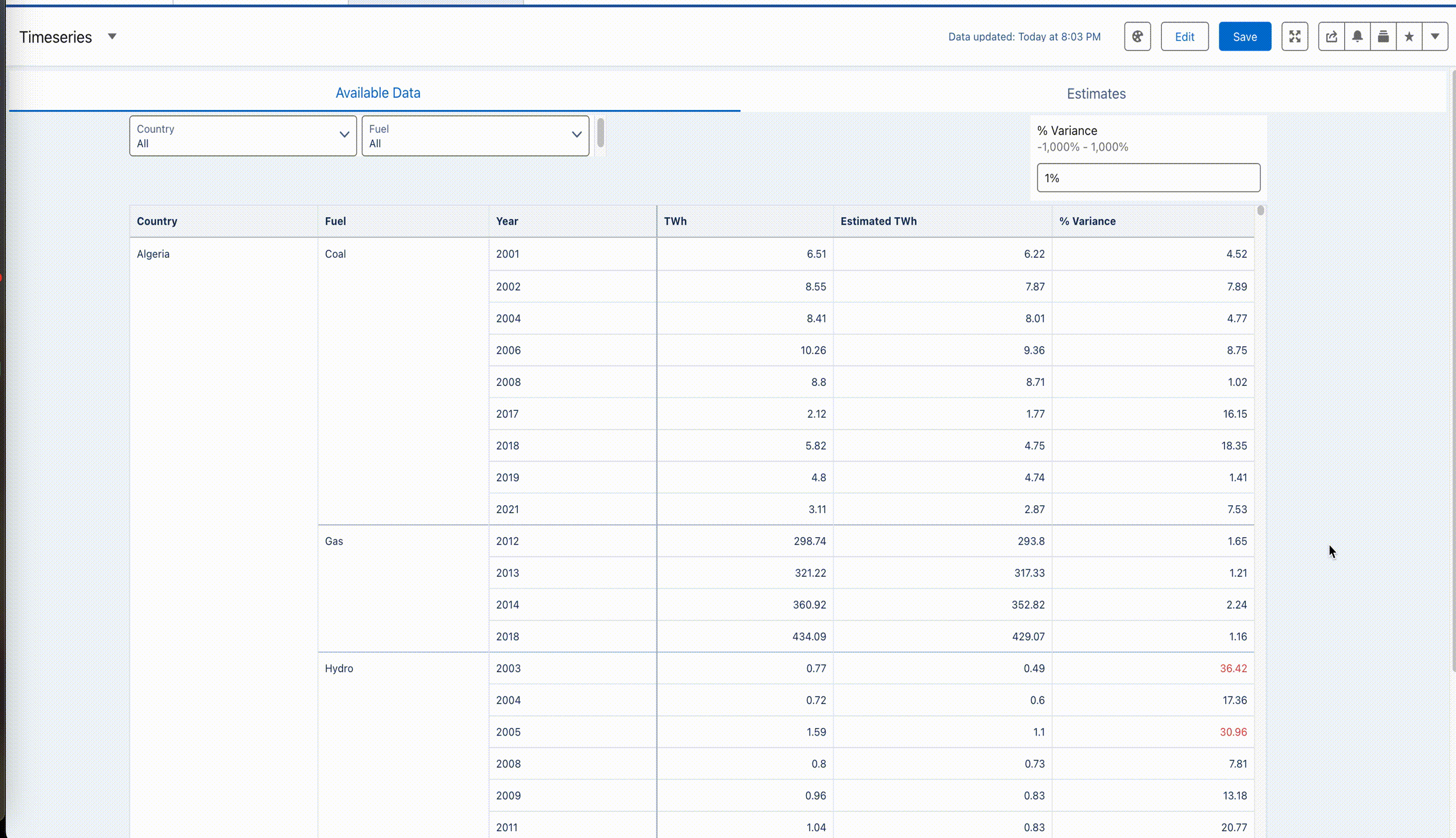
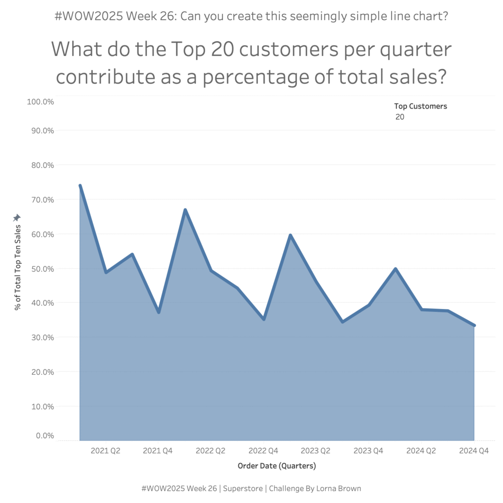
Introduction This may seem like a seeming normal line and area chart but I said “Why Tableau” numerous times when trying to create it.You want to be able to see the Top X customers per Quarter and what their percentage of total sales is. Click to open in Tableau Public Requirements Dashboard Size 800×800 1 …
#WOW2025 Week 26: Can you create this seemingly simple line chart? Read More