Introduction
Continuing with our community month, I decided to invite the OG himself back for a challenge, Andy Kriebel. All I’m going to say about this challenge is, I’m sorry if it’s super hard and don’t be afraid to sneak a peak into the actual workbook to get insight into how Andy’s mind works!
Requirements
- 1200×700
- # of sheets – up to you
- NO LODs
- Sort the bands alphabetically
- Clicking on a point in the trellis automatically deselects
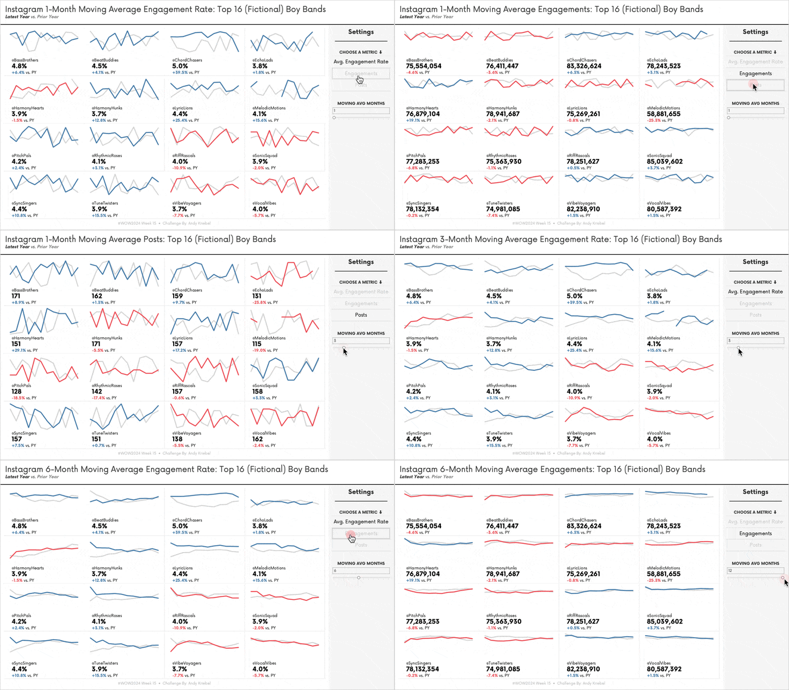
- Include an option to pick a metric
- This must also deselect
- Colour should change to the show which metric is selected
- Include an option to change the # of months for the moving average
- Lines should adjust accordingly
- 1 parameter max
- Match the tooltips
- Grey line = prior year
- Coloured line = latest year
- Lines are coloured by the year over year change
- Coloured lined must be in front of the grey line
- Include BANS on the lower left of each block
- The big number is the total (or average) for the latest year
- You can only have one field for the big number, but it must be display values differently depending on the metric. e.g., engagement rate is a %
- The % under the BAN is the YoY change and should match the colour of the line
- The dashboard title should adjust according to which metric is selected and the number of month selected
- You will need to do some data preparation due to the structure of the data
- Likely to need to use the function Last()
Dataset
This challenge uses a custom fabricated data set and is available from here.
Attribute
When you publish your solution on Tableau Public make sure to take the time and include a link to the original inspiration. Also include the hashtag #WOW2024 in your description to make it searchable!

Share
After you finish your workout, share on Twitter and/or LinkedIn using the hashtag #WOW2024 #Tableau and tag @WorkoutWednsday
