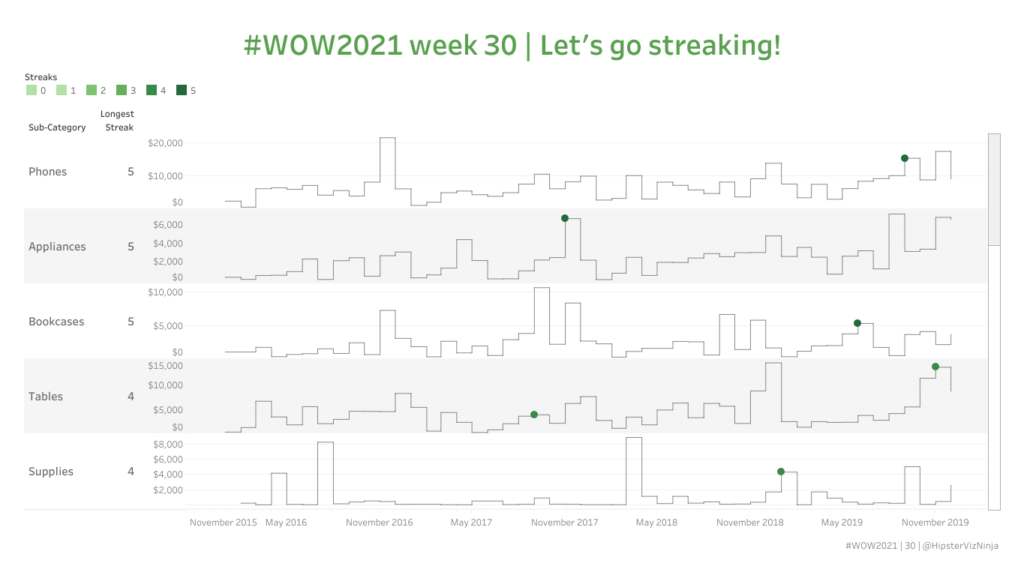
table calculations

2020 Week 27: What is the distribution of total orders by customer?

Introduction After many weeks of practical challenges. I’ve decided to switch it up this week. If I’m being honest I’ve been saving this challenge since August of last year (it’s still not the oldest challenge I am saving). This weeks challenge is to make a symmetrical dot plot. Not only is the dot plot symmetrical …

2020 Week 27: What is the distribution of total orders by customer? Read More

2020 Week 24: Can you compare a 3-day vs. 14-day moving average and describe the latest trend?

Introduction I’ve got an exciting challenge for you this week!  It involves collaboration with a peer of mine in the data community (Jami Delagrange, who you may recognize as an upcoming Community Month contributor) and also a challenge that involves working with COVID-19 data. This built-for-mobile dashboard was born out of seeking to understand the …

2020 Week 24: Can you compare a 3-day vs. 14-day moving average and describe the latest trend? Read More

2020 Week 18: Which products were most profitable?

Introduction Sometimes you want to make fun charts, but life gives you tables. This challenge is another real-life challenge I’ve encountered through Dr. Alicia Bembenek: show a table, but only highlight a subset of the products. An innocent challenge that is actually more difficult than it first appears. –LS. Be sure to check out the …

2020 Week 18: Which products were most profitable? Read More

Week 48: Can you build a Bar Chart that automatically combines small contributions?

How much information have you retained from Tableau Conference 2019?  Are you still watching session videos (like I am?).  This challenge is an homage to the amazing conference from this year. The challenge comes from something I encountered in a recent work situation.  The end-user wanted to be able to automatically group together small contributing …

Week 48: Can you build a Bar Chart that automatically combines small contributions? Read More

Week 42: Can you build a comparative line chart with dynamic inputs?

This week’s challenge is taken directly from a situation I recently had on a project.  The goal of the project was to be able to isolate out time periods of a specific length and compare it to the time period directly before it.  So as an example, if it’s October 2019, I want to look …

Week 42: Can you build a comparative line chart with dynamic inputs? Read More

Week 38: Can you build a sales comparison chart with performance indicators?

This week I’m tackling a topic that nearly everyone has been asked – visualizing good/bad as performance indicators that are red or green.  At least here in the western world, the busy executive tends to think about things in terms of traffic lights.  So this week your task is to create something that satisfies their …

Week 38: Can you build a sales comparison chart with performance indicators? Read More

Scroll to Top