
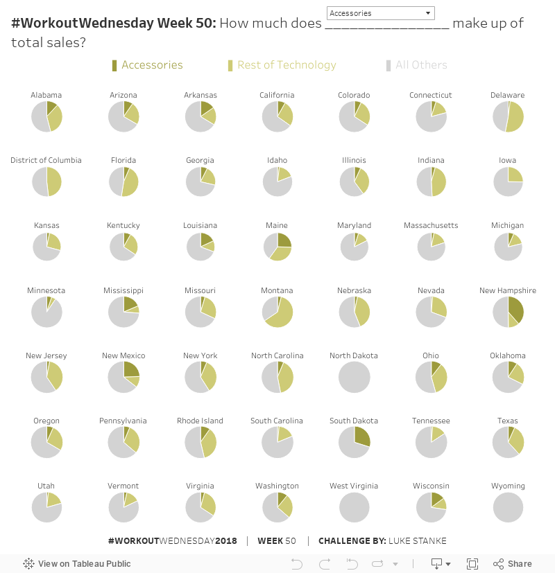
This week is another challenge that comes straight from work. I actually had difficulty creating the chart I wanted. I really wanted to sort the states by the selected Sub-Category percentage but I ran out of time and had to hack together a solution for this week. Either way the more important challenge is in creating the appropriate pie chart.
Challenge

Click to view on Tableau Public
Requirements
- Dashboard size is 800px wide by 800px tall.
- Create a pie for each state
- Use a parameter that describes each sub-category.
- Highlight the sales of the selected sub-category. Also highlight the remaining sales for the remainder of sub-categories that are share the same category of the selected sub-category. The third category will be all other sub-categories.
- Color by category. Use the Winter and Seattle Gray color palettes.
- Jedi-level: no hard-coding category to sub-category.
- Create the legend using a separate sheet.
- Match tooltips.
Dataset
This week uses the superstore dataset for Tableau 2018.3. You can get it here at data.world
Share
After you finish your workout, share on Twitter using the hashtag #WorkoutWednesday2018 and tag @AnnUJackson, @LukeStanke, @lorna_eden, @curtisharris_, @RodyZakovich, and @VizWizBI!
Track your progress
Also, don’t forget to track your progress using this Workout Wednesday form.
My attempt WOW#50
https://public.tableau.com/profile/md.forhad.akbar#!/vizhome/WOW50/WOW50
This was interesting but quite quick to overcome
Here’s my shot!
https://public.tableau.com/profile/marcodegola#!/vizhome/WorkoutWednesday2018-Part2/2018w50-ww?publish=yes
Added the ability to select # of rows and #columns for clarity: https://public.tableau.com/app/profile/w4768/viz/WOW2018Week50-PieChartsandParameters/WOW2018Wk50