EDITOR’S NOTE: This challenge was originally published on Emma Whyte’s Tableau blog which no longer exists. This challenge is republished here with the author’s permissions
This week I decided to re-create a makeover from Junk Charts in Tableau.

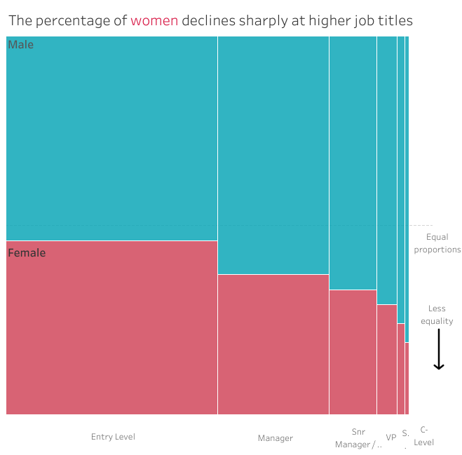
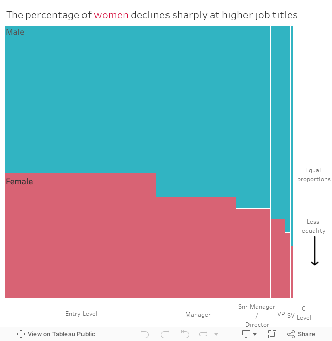
This image originally appeared in The Wall Street Journal and shows the percentage of men and women employed in different job levels. What makes this chart confusing is that the length of the bar represents how many jobs of that level make up the total workforce. The bar is then split by gender. When we get to the Vice President level or higher, the bars become way too small to see the gender split.

Junk Charts did a great makeover and instead opted for a Marimekko (see right).
I’ve never made a Marimekko chart in Tableau before so also thought it would give me the opportunity to try something new. Hopefully you’ve never made one either and you’ll learn something too! If you need some help to get started I recommend this excellent tutorial by Jonathan Drummey.