#WOW2017 | 20 | Comparing Regions

Introduction

EDITOR’S NOTE: This challenge was originally published on Emma Whyte’s Tableau blog which no longer exists. This challenge is republished here with the author’s permissions
 

This week’s challenge was given to me by Jeffrey Shaffer (Tableau Zen Master and co-author of the new Big Book of Dashboards).

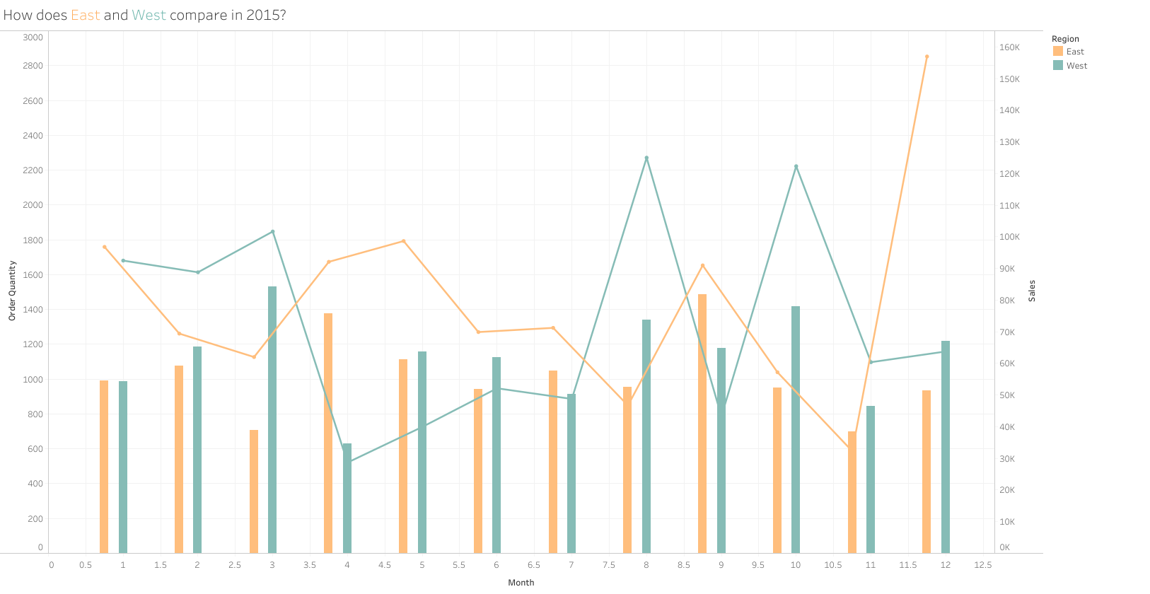
This was Jeffrey’s original challenge to me:

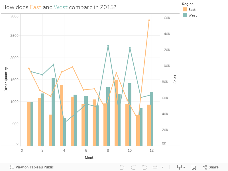
I had a go myself and got 90% of the way there. However I could not get the axis labels to display as abbreviated months!

So your challenge this week is to replicate my dashboard (image above or workbook below). Or as an extra challenge – attempt to get the axis labelling to display the months rather than numbers as Jeffrey has done.

Requirements

  • My dashboard size is 850*650
  • Quantity for the East and West regions should display as side-by-side bars
  • Sales for the East and West regions should be displayed as lines
  • I’ve filtered to 2015 only
  • Match the colours and tooltips
  • Match my axis labels (numeric months) or as an extra challenge Jeffreys labels (abbreviated months)

Dataset

Use the current version of Superstore of Download the data

Attribute

When you publish your solution on Tableau Public make sure to take the time and include a link to the original inspiration.  Also include the hashtag #WOW2023 in your description to make it searchable!

Share

After you finish your workout, share on Twitter and/or LinkedIn using the hashtag #WOW2023 @Tableau and tag @WorkoutWednsday @EmmaWhyte & @vizwizbi


Solution

Interactive

Scroll to Top