Introduction
There are often times when we’re making insightful dashboards where we’ll need to add annotations or text to make key points. Especially if we’re making dashboards for management or where the end user needs advice or actionable points.
This weeks #WorkoutWednesday is going to show you just one way of creating a dashboard where you can customise your insights depending on what’s in the view, or if the data updates or changes. This is great if your data updates monthly, quarterly, yearly, and you just need to change the comments, rather than re-work the entire dashboard.
Credit for this idea goes to Ryan Sleeper. You can check out his blog post on how he created his insight dashboard (but it will give you the answers, so only look after you’ve completed this weeks challenge).
Requirements
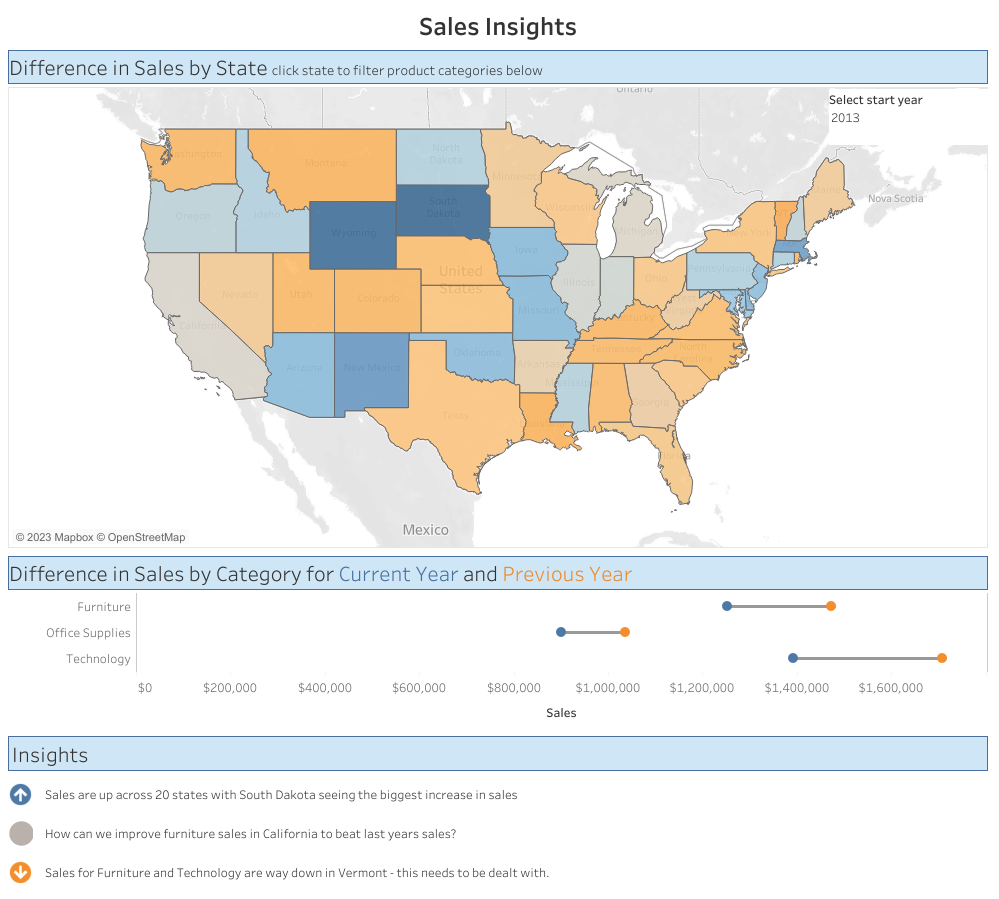
For this weeks challenge you’ll need to re-make the above dashboard (click image to see on Tableau Public). You’ll need to follow these important points too:
- The colour on the map is the percent difference in sales from the previous year to that selected by the user
- The barbell chart or DNA chart shows the sales value for the selected year and the previous year by product category
- The Insight section at the bottom should be completely customisable on the ‘Annotations’ dashboard. You should be able to enter 3 insights and select if they are positive, negative or neutral. This also changes the icon next to the insight text.
- The colours used are the default Tableau orange – blue gradient
Dataset
Use the current version of Superstore or download the data
Attribute
When you publish your solution on Tableau Public make sure to take the time and include a link to the original inspiration. Also include the hashtag #WOW2023 in your description to make it searchable!

Share
After you finish your workout, share on Twitter and/or LinkedIn using the hashtag #WOW2023 @Tableau and tag @WorkoutWednsday @EmmaWhyte & @vizwizbi
