Introduction
For this week’s challenge you’ll have already needed to complete part one. If you haven’t done part one yet, why not?!
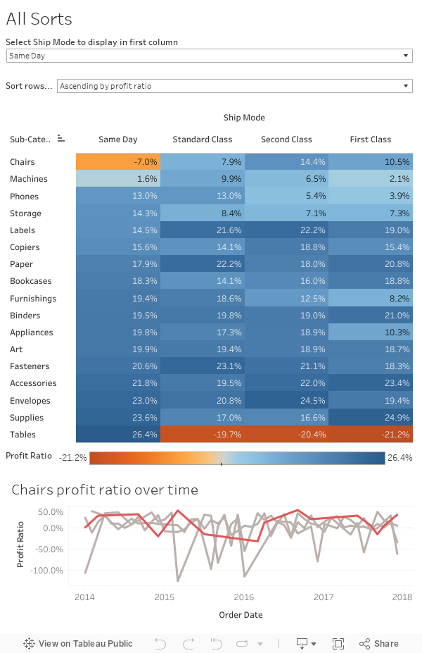
In the second part we’ll be introducing a line chart showing profit ratio over time. The catch being that the line chart should by default display the profit ratio for the product sub-category which is in the top row of the highlight table. If you select a different sub-category in the highlight table the line chart should change to show the selected sub-category instead.
Requirements
- Add a line chart showing profit ratio over time (continuous months) by each ship mode.
- The ship mode selected by the end user should be highlighted in red in the line chart, the rest in grey.
- The line chart should show by default the profit ratio for the product sub-category which is in the top row of the highlight table. Remember this can be changed by selecting a different ship mode or row sort.
- When a user selects a product sub-category in the highlight table the line chart should change to show the selected sub-category
Big thanks again to Neil Lord for the inspiration for this challenge. Make sure you’re following him on Twitter!
Dataset
Use the most recent version of Superstore – otherwise you can download this dataset
Attribute
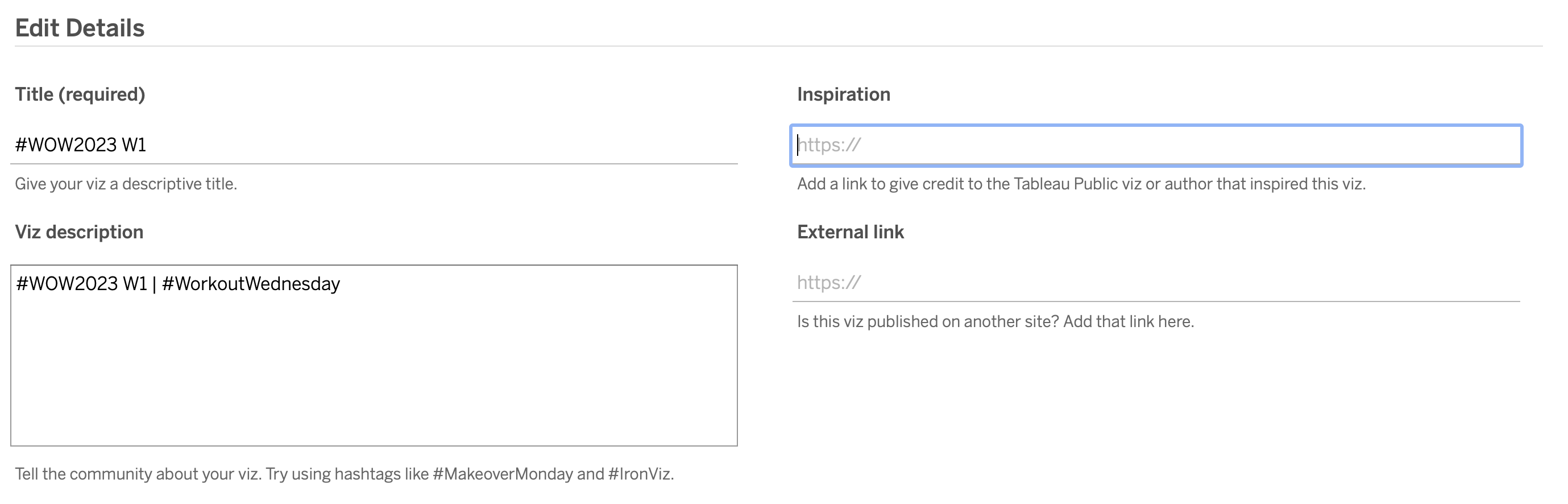
When you publish your solution on Tableau Public make sure to take the time and include a link to the original inspiration. Also include the hashtag #WOW2023 in your description to make it searchable!
Share
After you finish your workout, share on Twitter and/or LinkedIn using the hashtag #WOW2023 @Tableau and tag @WorkoutWednsday @EmmaWhyte & @vizwizbi
Solution
Interactive