Introduction
I’ve heard rumblings that the past few weeks have been a little difficult – so this week I’ve decided to keep it simple.
The final visualization comes from something I encountered recently. I have a client that works with data that is very volume specific per day, so they wanted a way to quickly compare a given day of week to recent peers. Seasonality is also a factor, so it didn’t make sense to go back too far in time.
The genesis of what we built was a bar chart, showing the amount for each of the given Wednesdays, but I felt something was missing. In the world of quick insights, it was hard to see at a glance “where” the current date fell among its peers. Sure you could compare the lengths of the bars, and could add an average line for even more insight, but a quick verbal utterance of performance still took some time.
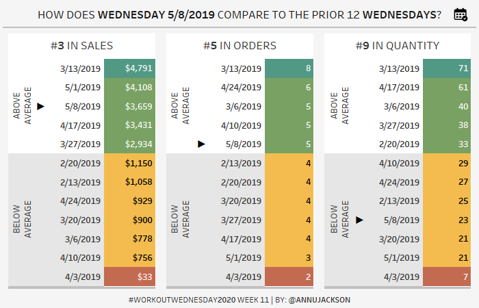
This led me to create a super simplified and synthesized version and this week’s challenge. The end user can select a date and compare to the prior 11 peers (for a total of 12 days). All the dates are then displayed in rank order by the metric, colored as to whether they are good/bad, the current date is marked differently, and the title synthesizes what you’re seeing.
I also wanted to bring in a few design elements that you may not be familiar with (specifically the shadowing on the boxes). This way, even if the technical part of the challenge isn’t difficult, you’ll be flexing your design skills.
Requirements
- Dashboard Size: 700px by 450px
- # of Sheets – not more than 4
- Create three ranked lists based on the following metrics
- Sales
- # Orders
- Quantity
- Allow users to input a date and have the prior 11 (for a total of 12) days of the same weekday display
- Arrange the dates by their performance, from best to worst
- Indicate the date that is the focus of analysis with an arrow
- Color the values as follows
- Dark green = maximum value within all displayed
- Light green = above average of the values
- Yellow = below average of the values
- Red = minimum value within all display
- Color palette is built in, Temperature Diverging
- Build headers that display Above/Below average
- Build a button that allows users to click and change the date
- Link to icon, which you can freely use without attribution
- Formatting
- Make a dynamic title for the dashboard
- Make a dynamic title that shows the rank of the date for each list
- Match tooltips
- Make sure there is a dark gray shadow beneath each sheet
Dataset
This week uses the superstore dataset for Tableau 2019.4. You can get it here at data.world
Attribute
When you publish your solution on Tableau Public make sure to take the time and include a link to the original inspiration. Also include the hashtag #WOW2020 in your description to make it searchable!

Share
After you finish your workout, share on Twitter using the hashtag #WOW2020 and tag @AnnUJackson, @LukeStanke, @lorna_eden, and @LosaniMeera

Um… isn’t this week 10?
Nope – it is actually week 11! I checked: https://www.epochconverter.com/weeknumbers We have a typo for week 9 (there are currently 2!).
Would you count it as #5 in orders according to the view above? The formula I used returned #3 as the other two numbers above it are also 5. I agree but interested in your thoughts!
Really enjoyed this and definitely something one of my clients will find useful. Looking forward to the solution video to see how to do the shadow properly as I suspect my solution was a total hack!
Will there be a solution video for this challenge?
The solution is now postd, thank you for your patience!
Thanks Nik! Solution is now posted 🙂
Great point Autumn. I dived into this a little bit in the solution. I think it would be appropriate to use your own business determination and definition for the ranking. I can see good arguments for both sides!
Thanks Ann! Learned a lot. Would be a bit better if the screen can have be zoomed out much more. Thanks!
Hi Ann, nice one this one.
Here’s my shot: https://bit.ly/WoW2020w11