Introduction
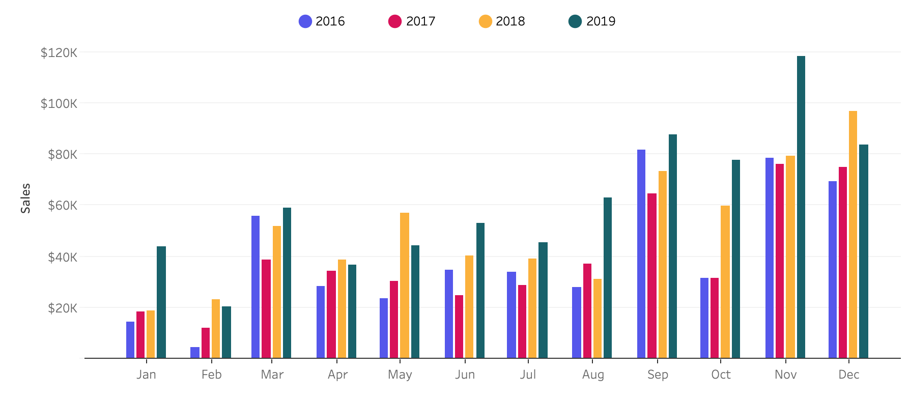
This week’s challenge is relatively straight-foward: remake a bar chart to look like a Microsoft Excel bar chart. The key to this chart is the extra whitespace between months.
Requirements
- Dashboard Size: 900px by 500px
- Show sales by month for each of the four years.
- Each bar should be 4 units wide with one unit of spacing between each bar.
- 2016 and 2017 should be to the left of the tick for the respective month. 2018 and 2019 to the right.
- Match formatting.
- Match tooltips.
Dataset
This week uses the superstore dataset for Tableau 2019.4. You can get it here at data.world
Attribute
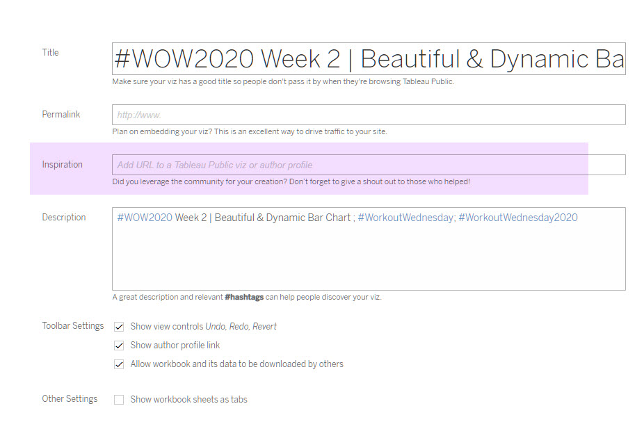
When you publish your solution on Tableau Public make sure to take the time and include a link to the original inspiration. Also include the hashtag #WOW2020 in your description to make it searchable!

Share
After you finish your workout, share on Twitter using the hashtag #WOW2020 and tag @AnnUJackson, @LukeStanke, @_Lorna_Brown and @IvettAlexa.


This is Amazing!
thanks for sharing this challenge!
Hi! Is there a solution video for this one?
Thank you!