Welcome to Community Month
Hey all! It’s Sean and I’M SO EXCITED to be here to kickoff #WOW2020 Community month! Over the course of the next 4 weeks, we’ll be hosting challenges from some incredible community members! For the last 2 two years, we’ve dedicated a month to highlight & promote some incredible members of the #WorkoutWednesday community. In return we allow them a platform to let their skills shine.
So strap in because they have some awesome challenges coming your way. So without further ado, here’s Kyle Yetter the his first challenge !
Introduction
After spending this year completing WOW challenges, I’m excited to kick off #WOW2020 Community Month with a challenge of my own! During the spring months when many states were mandating shelter in place, we saw a shift in our subscription business. As states were starting to announce opening things back up, our leadership team wanted a way to track what was happening with our subscriptions at a state level, comparing to prior year. So we set out to do just that, and came up with this dashboard.
Requirements
- -Dashboard size: 1000 x 700
- Because of the time I created the data set, “Today” = 7/15/2020
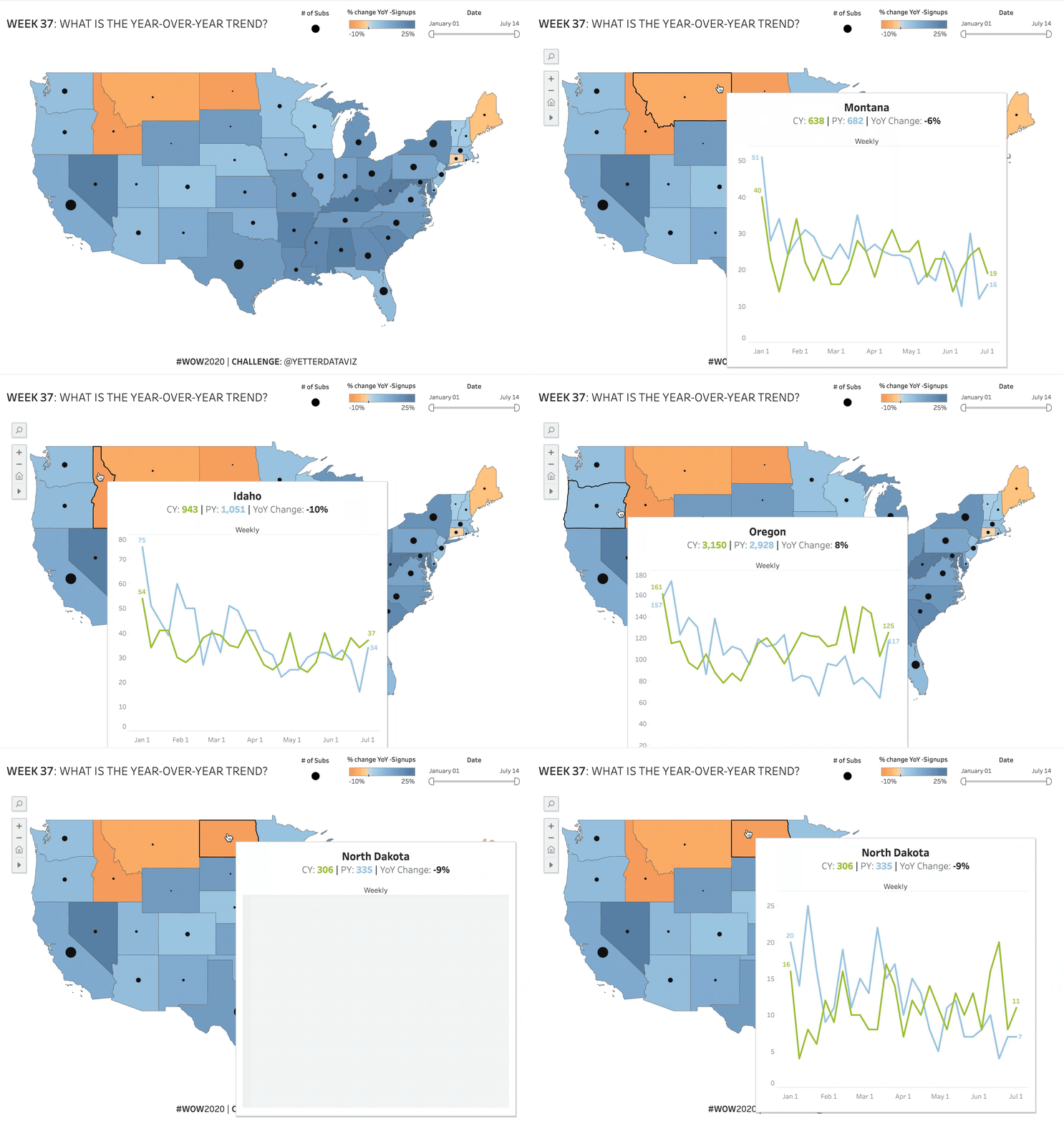
- Make a filled map with color based on the % change YoY of subscriptions
- Add a circle sized by the number of current year subscriptions
- Add a date filter that applies to the view, and make it so you can’t select any date past today
- Create a Viz in Tooltip that shows current and prior year subscriptions over time for the date filter selection, but on the same portion of the axis (one on top of the other rather than one after the other)
- The tooltip chart should show a daily grain if the date filter selection is less than 30 days, or a weekly grain if more than 30 days, and include a label identifying the date grain
- If a weekly grain, the tooltip chart should start on the weekday of the first date filter selection. It should also show only complete weeks.
- For example, if I select a date range of April 1 – June 1, the tooltip chart should have weekly data points for Apr 1, Apr 8, Apr 15, and so on through May 20 (since May 27-Jun 1 is an incomplete week).
- If a weekly grain, the tooltip chart should start on the weekday of the first date filter selection. It should also show only complete weeks.
- Add labels to the line ends of the tooltip chart
- Match tooltips, with YoY % change for the filled map tooltip, and % of total subs for the circle tooltip
- Match legends
Dataset
Attribute
When you publish your solution on Tableau Public make sure to take the time and include a link to the original inspiration. Also include the hashtag #WOW2020 in your description to make it searchable!

Share
After you finish your workout, share on Twitter using the hashtag #WOW2020 and tag @AnnUJackson, @LukeStanke, @_Lorna_Brown and @YetterDataViz

Firstly data in the workbook is of 4 years whereas the dataset uploaded on data.world is of two years only (2019-20).
Secondly, even after reviewing your workbook dataset, I found that for each state, sum of subs is lesser in year 2020 in comparison to prior year (2019). Then how come YoY% change is calculated as +ve value. According to me, it is coming in the range from -48.76% to -26.51%. Please clarify.