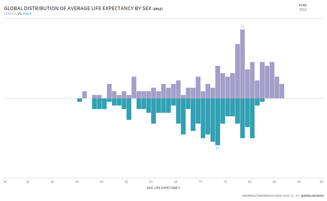
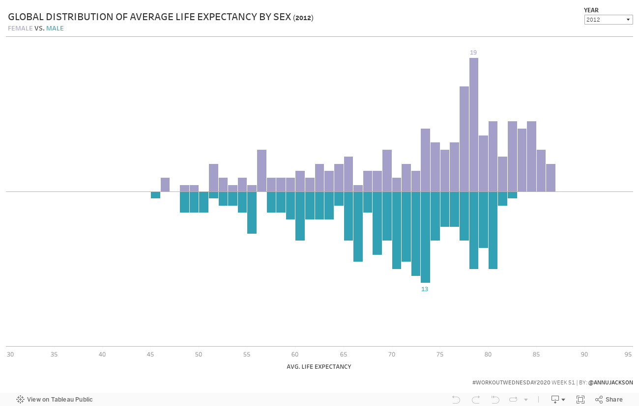
This is my last Workout Wednesday for 2020 (don’t worry, I’ll be back in 2021!), so I thought I’d take it easy on everyone. This week you’ll be building a single chart – a divergent histogram.
I first saw a divergent histogram via the Economist almost 3 years ago and tagged it as a chart idea I liked because it’s easy to compare the shapes of the two histograms together.
Create a divergent bar chart, showing the frequency of average life expectancy (by country) for males and females
Match tooltips, which are pretty simple
Match colors (Nuriel Stone)
X-axis range is locked from 30 to 95
Y-axis range is dynamic based on the data and changes per year (but is identical for female/male)
A small hint: you are allowed to reshape the data if it makes it easier for you to build the chart. If you do reshape the data, use built-in Tableau Desktop features (pivot or copy/paste clipboard data)
Dataset
This week uses the World Indicators dataset for Tableau 2020.3. You can get it here at data.world
Attribute
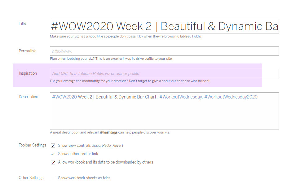
When you publish your solution on Tableau Public make sure to take the time and include a link to the original inspiration. Also include the hashtag #WOW2020 in your description to make it searchable!

Hi Ann,
Is the filter “Include/Exclude Values” option a requirement ?