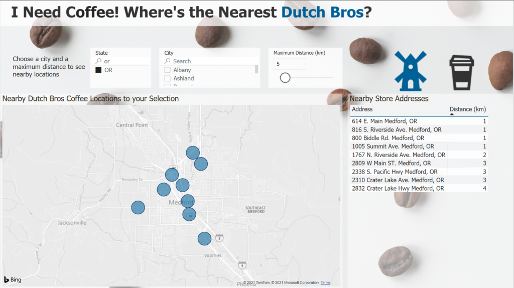
2021 Week 43 | Power BI: Maps with a Distance Radius
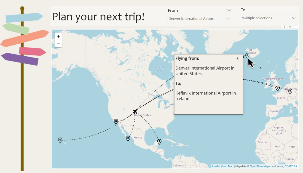
Introduction It’s the final week of mapping month! This week we are plotting points on a map within a selected radius. It’s common to want to see locations, such as stores or restaurants that are nearby to a selected location. This week we are exploring one way to do that in Power BI. This involves …
2021 Week 43 | Power BI: Maps with a Distance Radius Read More