Introduction
Is it too late now to start the post with Happy New Year? Well it’s my first Workout of the year so Happy New Year everyone, it’s really great to be back for my third year!
After completing the first two workouts from this year (because I suck at Table Calculations), I wanted to continue on the theme of Table Calculations so I can get better at them. So this week is a mixture of things, but mainly focused on the Control Chart.
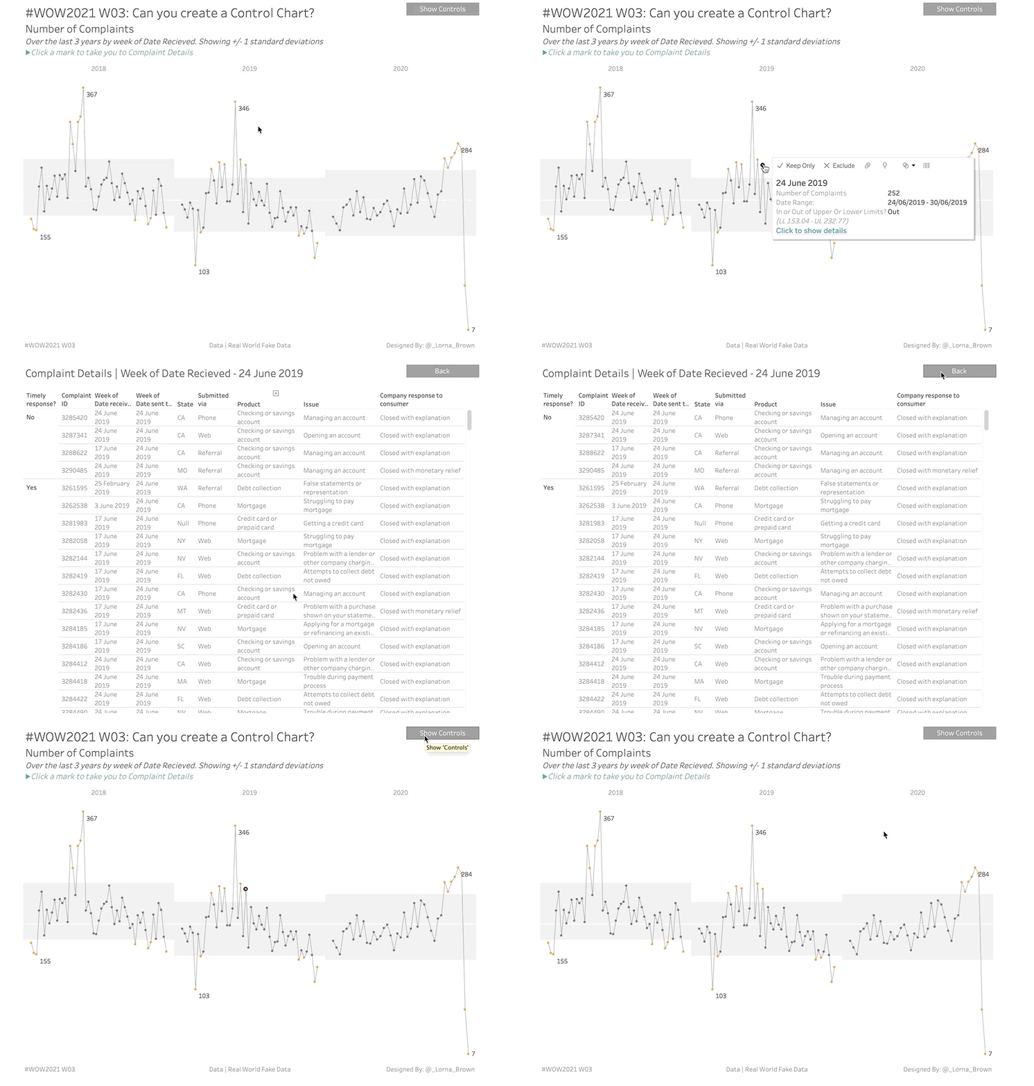
A control chart allows you to see points which are above or below a certain threshold, in this case we are using Standard Deviations.
Requirements
- Dashboard Size: 900px by 700 px
- # of Sheets and Dashboards- up to you
- Create a weekly view of number of complaints by either Date Submitted or Date Received
- Show only the last X years
- If a week rolls into a new year, make sure the full week is in the prior year
- Create an Upper and Lower Limit reference band using X (1-3) Standard Deviations
- This should be different by each year and should use TABLE CALCULATIONS
- The coloured dots should be if it is outside the upper or lower limits
- Hide the controls with a button
- When selecting a mark, it should allow you to click to hyperlink to show the complaint details table filtered to that specific mark
- Add a back button to the complaint details page
- Match Tooltips
Dataset
This week uses data from Real World Fake Data by Mark Bradbourne. Get the data from here: Financial Services Consumer Complaints
Attribute
When you publish your solution on Tableau Public make sure to take the time and include a link to the original inspiration. Also include the hashtag #WOW2021 in your description to make it searchable!

Share
After you finish your workout, share on Twitter using the hashtag #WOW2021 and tag @AnnUJackson, @ItsCandraM, @LukeStanke, @_Lorna_Brown and @HipsterVizNinja

Hi,
Learned a lot working on this challenge! I was able to reproduce the solution (following the video), but I have one outstanding issue, how to create the date range in the tooltip for the line chart. Interestingly enough, I was able to create the date range on the detail chart (even though that was not included in the solution), but the same fields did not work on the line chart. Can you provide a solution that works?
Thanks!
Tom
Hi Lorna,
Thanks for the amazing insights in your video. I would like to understand how you formulated the standard deviation calculation using window_avg and window_stdev. Can you please through some light on how you calculated it?
Thanks,
Mani