Hey there #WOWzers! How’s everyone doing? Are ready for another great challenge? This one is gonna be a bit different than normal weeks. What’s different about this is the inspiration. This challenge comes as a remake of great, “simple” chart.
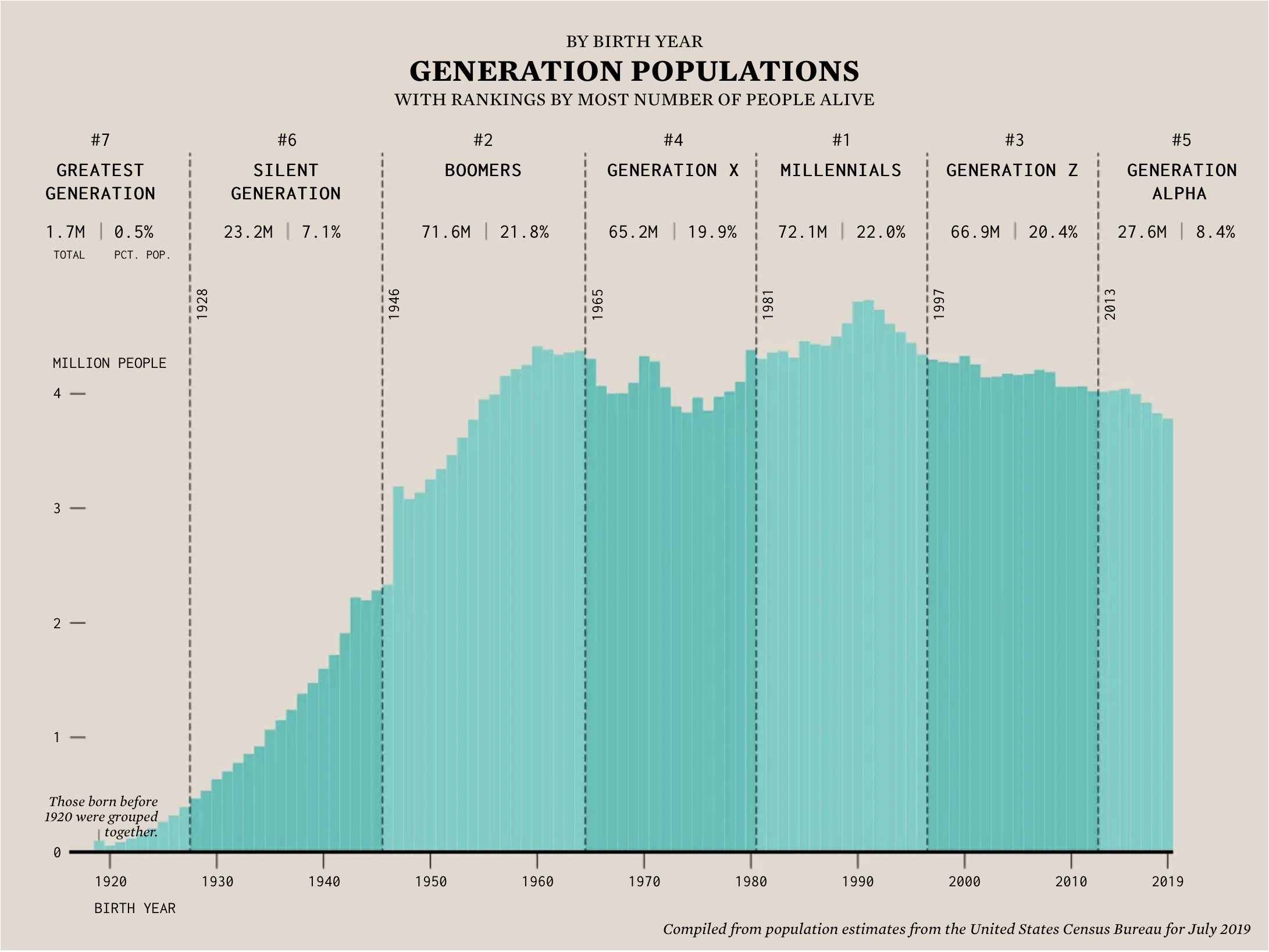
The other night, while scrolling Twitter I came across this tweet from Nathan Yau, author of very popular dataviz website, FlowingData.com and I instantly knew this would make a great workout. And boy did it! Let’s take a look
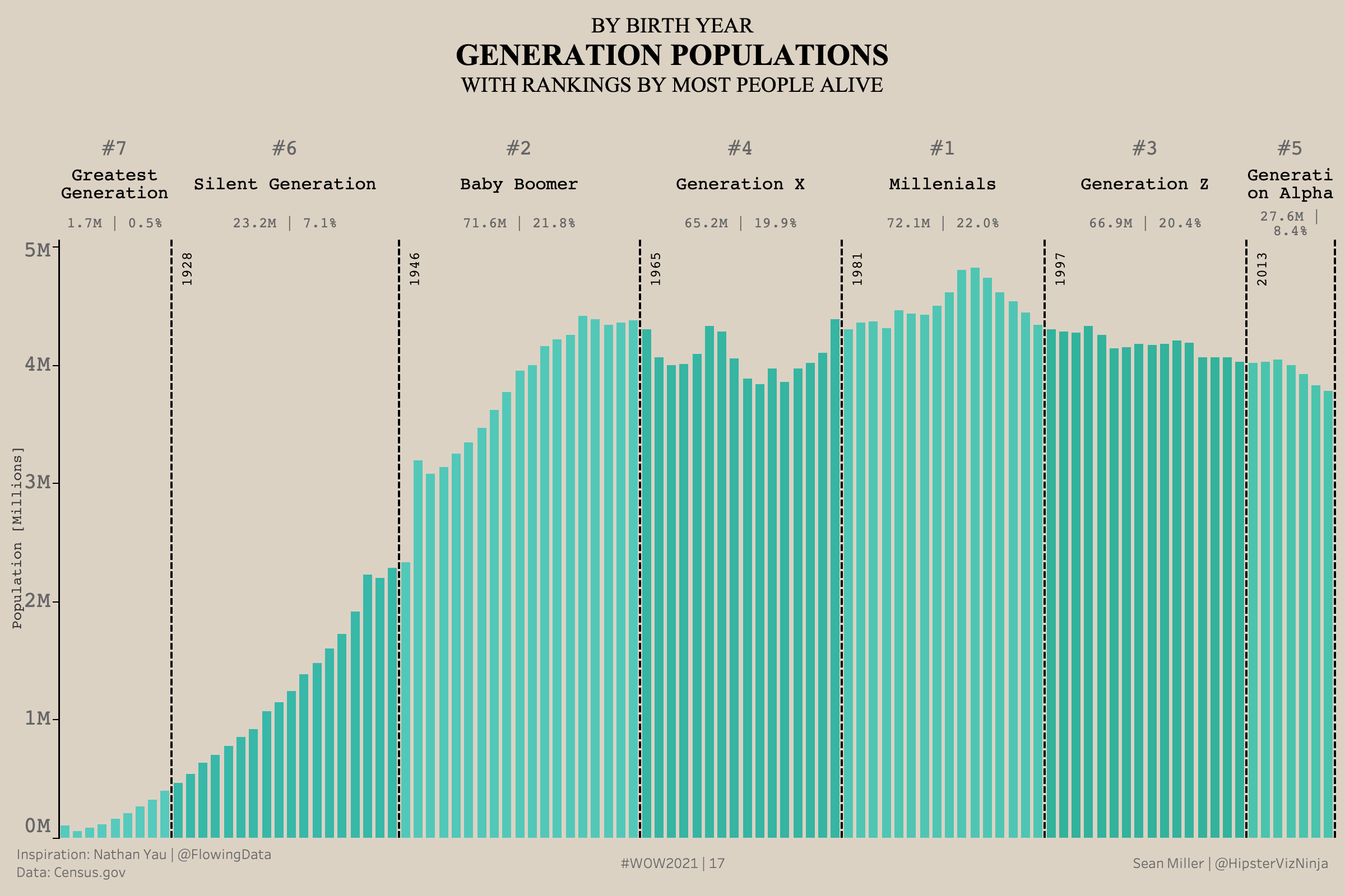
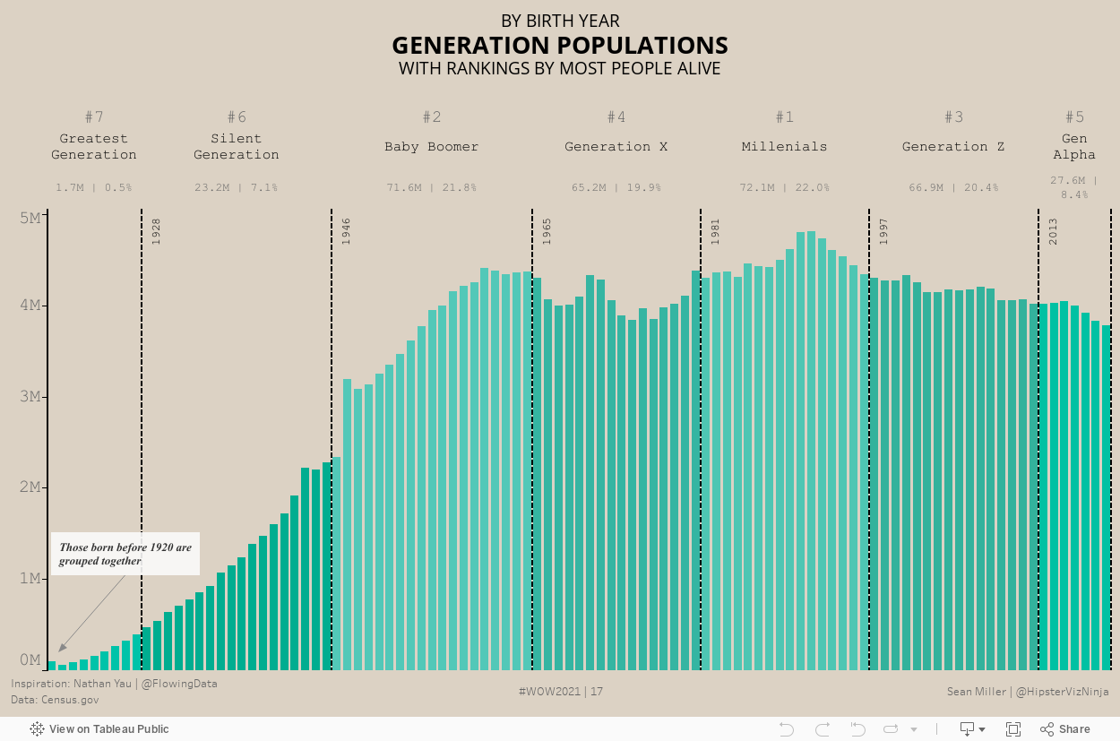
So here’s your challenge, let’s recreate this dashboard as closely as possible. There are a few things that I just could not get to match but I got pretty close. If you’re feeling up for it, get closer than I did. Check out my recreation and the requirements below!
Oh and one more thing. Please remember to just have fun!
Add a total population and % of total by each generation
Add the rank of each generation based on total population
Sort the based based on year
Divide each generation with a dashed line and add a label for that year
Colors
Background: #DCD2C4
Light Teal: 00C3A9
Dark Teal: 00AD90
Fonts:
Title and Annotation: Times New Roman
Column Header, Generation line label and tooltip: Courier
Dataset
This week uses a Census dataset. You can get it here at data.world
Attribute
When you publish your solution on Tableau Public make sure to take the time and include a link to the original inspiration. Also include the hashtag #WOW2021 in your description to make it searchable!