Introduction
How is it that time of the week already? This week I have a challenge for you which hones in on some of the Map Layers and Spatial Calculations. It is using a dataset recreated by a colleague of mine Dan Farmer as he posted a similar visualisation internally. Thanks for the inspiration Dan.
Requirements
- Dashboard Size: 1000px by 600 px
- # of Sheets – up to you
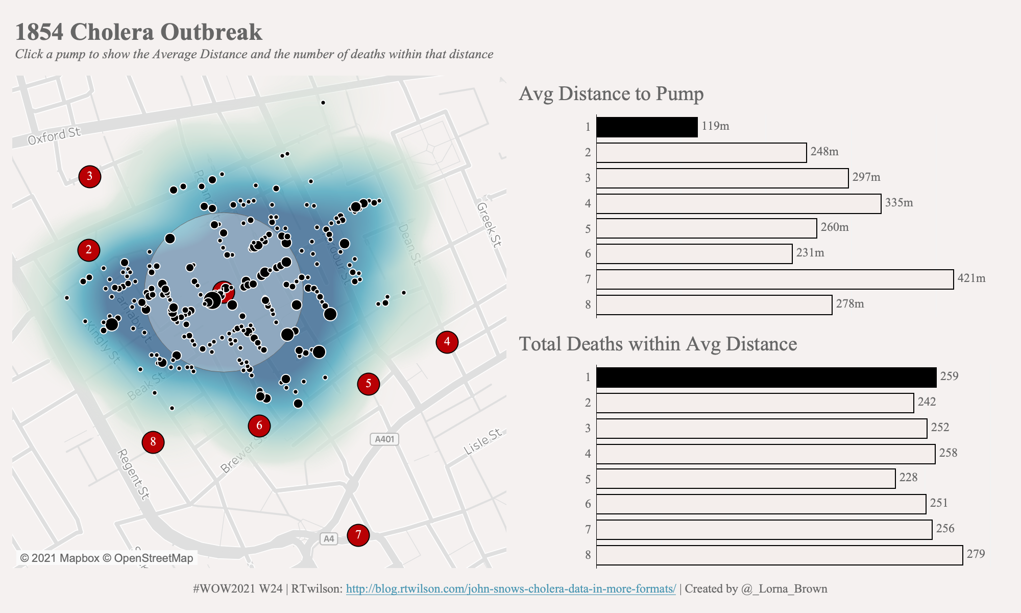
- Create a Map which shows
- the Pump locations
- number of deaths at certain locations
- the density of deaths
- the average distance to pump based on individual deaths
- Create two bar charts to show average distance to pump and number of deaths within the Average Distance
- Create an action to be able to change the pump buffer on the map
Dataset
This week uses the Cholera Data, which you can get from data.world
Attribute
When you publish your solution on Tableau Public make sure to take the time and include a link to the original inspiration. Also include the hashtag #WOW2021 in your description to make it searchable!

Share
After you finish your workout, share on Twitter using the hashtag #WOW2021 and tag @AnnUJackson, @ItsCandraM, @LukeStanke, @_Lorna_Brown and @HipsterVizNinja
