This week’s challenge is brought to you by a guest coach, my colleague Valerija Kirjackaja, who came across this problem at work and created a beautiful solution for it.
How often do you get asked to re-create Excel tables in Tableau? On a scale from 1 to ‘I am never doing this again’ – how frustrated do you get when it comes to formatting? This challenge does not necessarily offer an easy workaround but should hopefully be useful for the next time you have to build a conditionally-formatted MoM table for your Finance department.
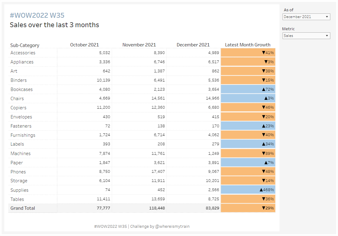
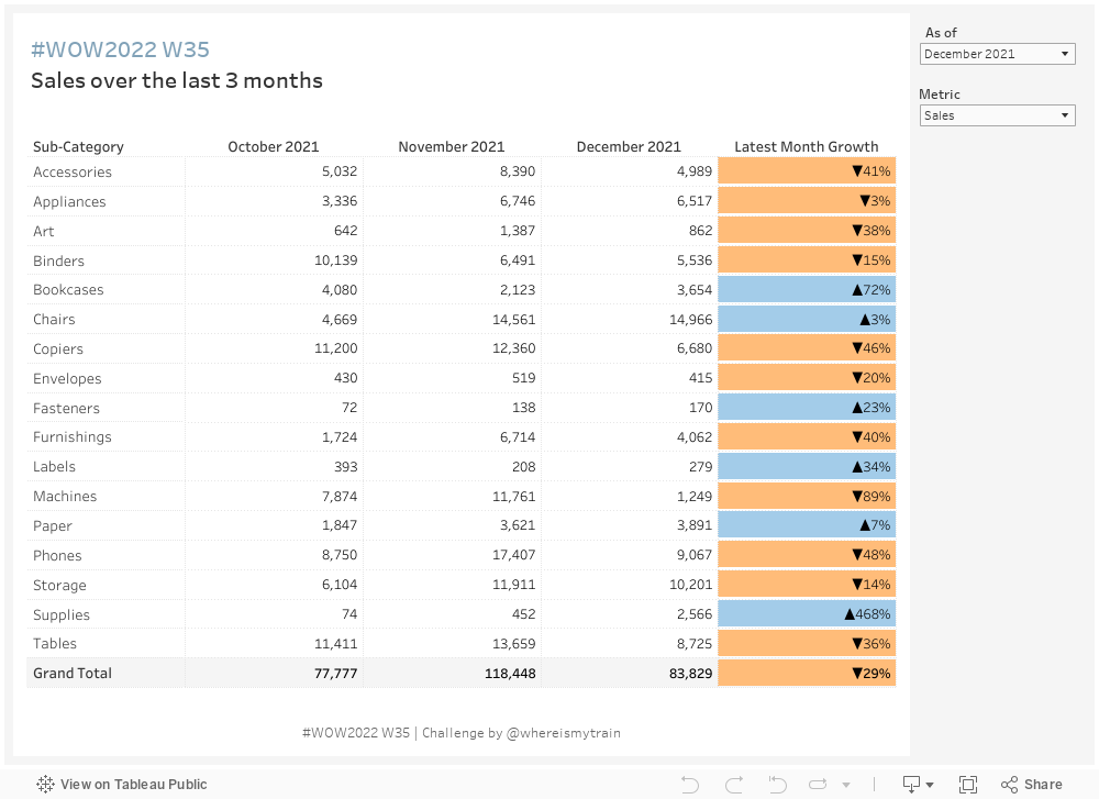
This week’s task is to create a table showing the last three months of Sales/Profit/Avg. Days to Ship values and evaluate the change in the latest month compared to the previous one.
·User
should be able to select the Latest Month they want to see from the dropdown
(make sure months in the dropdown are sorted with most recent on the top).
·Table
headers should update dynamically based on the selected latest month.
·User
should be able to choose from 3 metrics: Sales, Profit, or Average Days to Ship
·Colour
Latest Month Growth column: blue (#a3cce9) if we did better in the latest month
than in the previous month, orange if we did worse (#ffbc79). Note that unlike
for Sales and Profit, for Average Days to Ship change is ‘better’ if the numbers
decrease.
·Show
values with no decimal points in the table but include 2 decimal point in the
tooltips.
·Match
the formatting.
Dataset
This week uses Sample Superstore 2021 data. You can find it here on Data.World
Attribute
When you publish your solution on Tableau Public make sure to take the time and include a link to the original inspiration. Also include the hashtag #WOW2022 in your description to make it searchable!

Beg for the solution video!