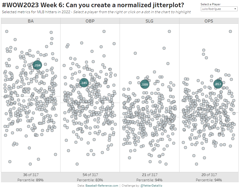
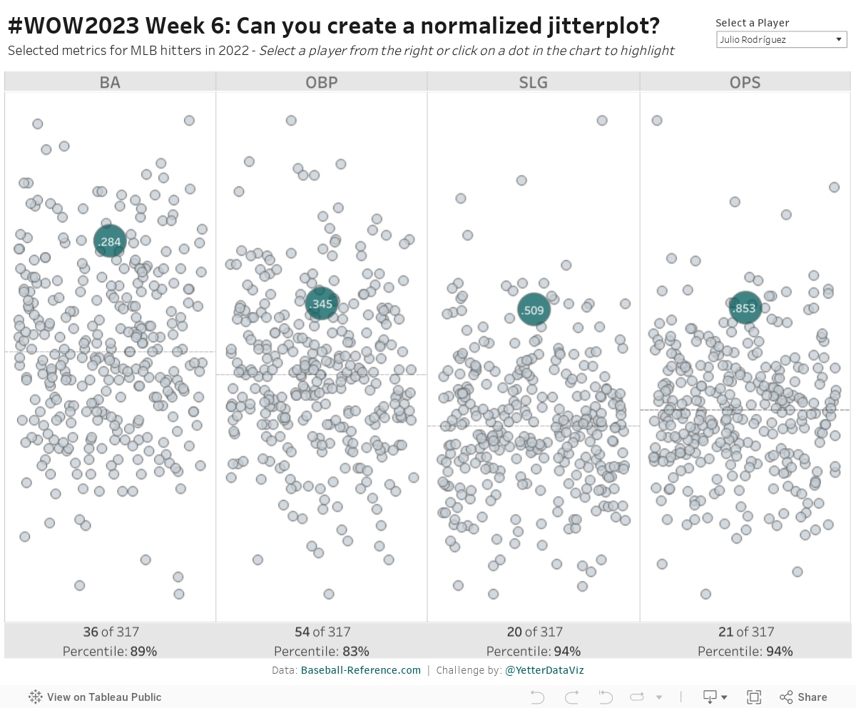
As Donna mentioned last week, this month we’re focusing on alternative chart types. This jitterplot is a fun one inspired by one of Steve Wexler‘s charts in The Big Book of Dashboards. I like jitterplots because they allow you to easily see how an individual compares to the rest of the group via distribution, not just compared to an average or a median.
And since Major League Baseball Spring Training is coming up in a couple weeks, it’s time to look at some baseball data again!
Create a jitterplot showing all players in each of the 4 metrics on a normalized scale (0 to 1), with the ability to select a specific player
The selected player should be highlighted by color and size, labeled with the metric value
Create a dashed median line
If you click on a gray circle, that player becomes the selected player.
Show the rank and percentile for the selected player at the bottom of the chart
Match tooltips and formatting (if you want to match my colors, they are #005C5C and #C4CED4)
Dataset
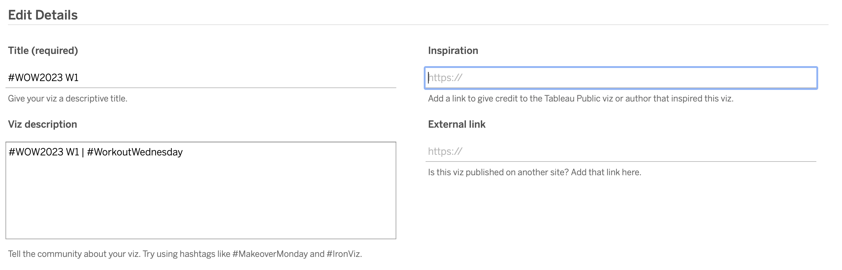
This week uses a custom data set from Baseball-Reference.com, please be sure to attribute it on your solution. You can find it here on Data.World.
Attribute
When you publish your solution on Tableau Public make sure to take the time and include a link to the original inspiration. Also include the hashtag #WOW2023 in your description to make it searchable!