
Introduction
My past few challenges have been quite heavy on the formatting. Today I wanted to take a break from challenging you to format your workbooks, to showing you a powerful feature in Sigma that I don’t see used as often as I think it should be. Trellising!
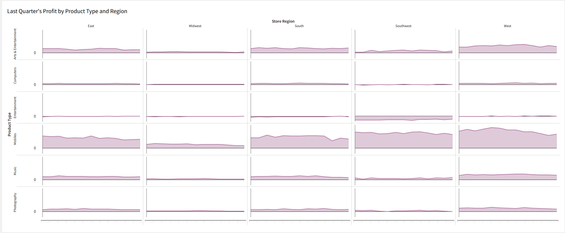
If you’re not familiar with trellising, it can be done to many different kinds of charts – Bars, lines, areas, scatterplots, pies, and donuts. Trellising a chart means to split its categories across multiple, smaller visualizations. Trellising is useful if you’re looking to detect deviations from patterns/trends in specific segments of your data. It’s a good tool to have on hand when your ‘color by category’ scatter plot starts looks like someone spilled Fruity Pebbles on your Grateful Dead area rug.
So let’s dig in to trellising with Sigma!
Need access to Sigma?
Note: You will only have view access to WOW Workbooks, Folders, and Workspaces, not edit access. Please create your WOW Workbooks under “My Documents.” We suggest creating a folder to organize all your workbooks.
Requirements
- Create the source table
- Create a ‘Source’ tab and add a new table. The table should be under Sigma Sample Database > RETAIL > PLUGS_ELECTRONICS > PLUGS_ELECTRONICS_HANDS_ON_LAB_DATA
- You only need to pull in Date, Quantity, Cost, Price, Product Type, and Store Region
- Create your Trellised Area chart
- Start by creating a normal area chart of the Avg Profit per Order by Week from the previous complete quarter
- Hint: Profit is sitting in the ‘Metrics’ tab, and to get the previous complete quarter, you’ll need to filter the visualization
- Select the ‘Trellis’ tab
- Move ‘Product Type’ to the Trellis Row
- Move ‘Store Region’ to the Trellis Column
- Formatting
- Change the color if you’d like
- Under “Element Format” (paintbrush icon)
- Select ‘X-axis’ and hide the labels
- Select ‘Trellis’ and change Tile size to ‘Compact’
- Note: for an analysis of trends, we can also uncheck ‘Share Y-Axis’ to normalize our visualizaitons and remove some of the bias related to the size/number of stores in a region
- Select ‘Area Style’ and check ‘Show Line’
- Change the title of the visualization to ‘Last Quarter’s Profit by Product Type and Region’
- Resize the tile so it fits on your screen without scrolling
- Start by creating a normal area chart of the Avg Profit per Order by Week from the previous complete quarter
- Call your managers in your Southwest stores and offer their Entertainment departments some help.
Dataset
Sigma Sample Database > RETAIL > PLUGS_ELECTRONICS > PLUGS_ELECTRONICS_HANDS_ON_LAB_DATA
Share
After you finish your workout, share on LinkedIn, Sigma’s Community page, (or Twitter) using the hashtags #WOW2024 and #SigmaComputing, and tag Ashley Bennett, Eric Heidbreder, and Katrina Menne!
Also, make sure to fill out the Submission Tracker so that we can count you as a participant this week to track our participation throughout the year.