Introduction
This week’s challenge comes from Chasoso (Hideaki Yamamoto), who is an active participant in WorkoutWednesday and was the runner-up in last year’s Viz contest at the Japan Tableau User Group (JTUG) annual meeting.
# Introduction(EN)
I’m very happy to join Workout Wednesday as a guest coach.
Because I’ve been encountering interesting vizzes every week, I admire the coaches who create these visses.
So, I’ve done my best to create an interesting challenge that is no less worthy of such a fantastic team of coaches.
This week’s challenge is a sales dashboard.
If you have created dashboards as a part of your job, you may frequently see dashboards like this.
However, I thought up an idea to make the dashboard more interactive, smarter, cooler and cuter.
While I have seen various dashboards, both business-related and otherwise, I’ve noticed a lack of effective utilization of headers in many of them.
So, let’s learn how to utilize Tableau’s headers to expand your range of visualization!
Have fun!
# Introduction(JP)
ゲスト出題者としてWOWに参加できることをとても嬉しく思います。
興味深いVizが毎週投稿されているのを見て、出題者にとても憧れを持っていました。
そのような素晴らしい出題者陣に引けを取らないような面白い問題を、私なりに作成してきました。
さて、今週のお題は売上ダッシュボードです。
業務でダッシュボードを作成される方は見慣れたようなものかもしれません。
しかし、よりインタラクティブで、よりスマートで、よりかっこよく、よりかわいらしい見た目になるようなアイデアを私は思いつきました。
これまで色々なVizを(業務内外問わず)見てきましたが、あまりヘッダーを有効活用したダッシュボードは多くないと感じました。
この問題を通して、ヘッダーを活用したビジュアライズ表現の幅をぜひ広めてください!
ぜひ楽しんでいってください!
Requirements
# Requirements(EN)
【Common to Levels 1-3】
・Dashboard size: 1200px x 700px
・1 sheet
・FY (fiscal year) starts in April and ends in March (Many Japanese companies adopt a FY starting in April)
【Level 1】
・Latest FY’s comulative sales and previous FY’s comulative sales are displayed by region in line graphs
・Latest FY’s monthly sales values by region are displayed in bar graphs
・Previous FY’s monthly sales shown as reference lines
・Match formatting & tooltips
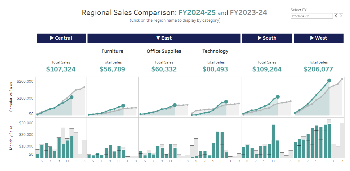
【Level 2】
・Clicking on region name headers drills down to display subcategories for the clicked region only
・Clicking the same region name again drills back up
・The mark (circle) for the latest FY month on line graphs is displayed larger than those for other months/years
・Meets all Level 1 requirements
【Level 3】
・Can select which FY to display
・FY in sheet title also changes accordingly
・FY parameter should not be hard-coded, and the latest year should always be initially displayed
・Area below line graphs is filled with semi-transparent color
・Meets all Level 2 requirements
# Requirements(JP)
【Level1-3共通】
・ダッシュボードサイズ:1200px x 700px
・1シート
・FY(財務年度)は4月始まり3月終わり(日本の多くの企業は4月始まりの財務年度を採用しています)
【Level 1】
・最新年度と前年度の月別売上の累計が地域ごとに線グラフで表示されていること
・地域ごとの最新年度の単月売上が棒グラフとして表示されていること
・前年度の単月売上がリファレンスラインとして表示されていること
・外見とツールヒントを一致させること
【Level 2】
・地域名ヘッダー等をクリックすると、クリックした地域だけサブカテゴリごとにドリルダウンして表示されること
・もう一度同じ地域名をクリックすると、ドリルアップされること
・線グラフの最新年月のマーク(円)が、他の年月より大きく表示されていること
・Level 1の要件をすべて満たしていること
【Level 3】
・表示する財務年度を選択できること
・シートのタイトルの年度表記も同時に変更されること
・財務年度のパラメーターはハードコーディングせず、常に最新年度が初期表示されること
・線グラフの下の領域が半透明な色で塗りつぶされていること
・Level 2の要件をすべて満たしていること
Dataset
This week uses Superstore data set. You can download it form here.
Attribute
When you publish your solution on Tableau Public make sure to take the time and include a link to the original inspiration. Also include the hashtag #WOW2024 in your description to make it searchable!

Share
After you finish your workout, share on Twitter and/or LinkedIn using the hashtag #WOW2024 #Tableau and tag @WorkoutWednsday and @_Chasoso
Solution
Interactive