Introduction
Welcome to Week Twenty-Eight! Now that we are firmly in Summer Mode, let’s plan a lake vacation! This week, we’re going to evaluate water quality monitoring data in the Great Lakes.
The dataset we’re using comes from Data.Gov. This dataset has many different characteristics measured in one long table. Don’t worry. I’ve already created a Sigma dataset for you.
In this challenge, we’re going to create a dynamic workbook with a custom map.
Good Luck!
-Ashley
Need access to Sigma?
Note: You will only have view access to WOW Workbooks, Folders, and Workspaces, not edit access. Please create your WOW Workbooks under “My Documents.” We suggest creating a folder to organize all your workbooks.
Requirements
- On a hidden Data Tab:
- Add the Great Lakes Water Quality Dataset: Workspaces / Workout Wednesday / 2024 / 2024W28 – Are you ready for vacation? / Great Lakes Water Quality
- Note the pre-defined Metrics available. We will use Number of Tests, Avg Result, Min Result, and Max Result.
- Filter this dataset to only include a record if it [Is Quantifiable Result]
- Create a Summary Value to find the Units of the Characteristic chosen in the page control created in the next step.
- Add the Great Lakes Water Quality Dataset: Workspaces / Workout Wednesday / 2024 / 2024W28 – Are you ready for vacation? / Great Lakes Water Quality
- On a visible page:
- Create several page controls to filter your dataset:
- Characteristic: Required, and allow only 1 value. Show the Search Box & Histogram.
- Start Year as a List Control sorted with the most current year first.
- Location Name: Do not apply to the map
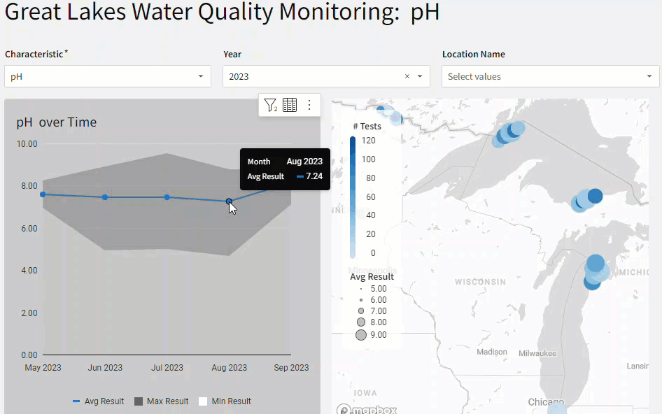
- Create a Map – Point
- Longitude & Latitude are clearly labeled as such
- Color = Number of Tests
- Size = Avg Result
- ToolTip
- Location Name (Hint: You’ll need to aggregate a list, but each Point only has 1 Location Name)
- Hide Longitude & Latitude
- Show Legend Headers, and be sure the names take as little space as possible
- Filter the entire Page when clicking on a Point
- Create a combo chart to visualize the Avg, Max, and Min Result Over Time
- X-Axis = Month of Start Date, formatted to Month Year (i.e. July 2023)
- Y-Axis
- Avg Result: Line
- Max Result: Area. Color = #626262
- Min Result: Area. Color = #FFFFFF
- Formatting:
- Add a background. Use the Color Picker to find the exact color shown below the Min Result Line. This will create the illusion of a non-static band around the Average.
- Add a Title with Dynamic Text that clearly states which Characteristic and Units you are displaying
- Display the Legend on bottom
- Show points on the Average Line only
- Finishing Touches
- Give the Page a Descriptive Title that uses Dynamic Text to display the selected Characteristic and Units
- Arrange your elements into a cohesive dashboard
- Create several page controls to filter your dataset:
Dataset
Workspaces / Workout Wednesday / 2024 / 2024W28 – Are you ready for vacation? / Great Lakes Water Quality
Share
After you finish your workout, share on LinkedIn, Sigma’s Community page, (or Twitter) using the hashtags #WOW2024 and #SigmaComputing, and tag Ashley Bennett, Eric Heidbreder, and Katrina Menne!
Create an interactive, sharable version of your solution here.
Also, make sure to fill out the Submission Tracker so that we can count you as a participant this week to track our participation throughout the year.