Introduction
Hello there! I’m Yoshi and I joined the WOW Tableau coach team this year.
I’ve been participating in the WOW challenges since 2020, so I am really honored to be one of the coaches.
Here’s my first challenge for you: let’s practice datetime calculations and data densifications.
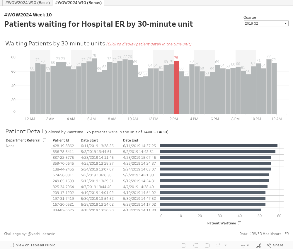
This week, we deal with dummy data regarding the emergency room at a hospital and visualize when it gets busy.
The data records when patients arrived and how long they had to wait. From this data, we want to visualize how many patients were waiting in each 30-minute interval over a 24-hour period.
To achieve this, for example, if a patient waited from 0:00 am to 0:45 am, we want to count them as waiting for both the 0:00 – 0:30 am and 0:30 – 1:00 am intervals.
However, since the data only has one record for this patient, we need to do something about it.
One approach to this problem is data densification. You’ll also need some calculation fields to handle datetime values. I hope you’ll have fun!

Requirements
- Dashboard Size: 1000 x 800px
- 2 sheets
- Set a Relation between Hospital ER (prepped).csv and Densification Dummy.xlsx to properly densify the data.
- Allow users to filter data by quarter (using [Date Start], set as single select).
- Create a bar chart displaying the number of patients waiting during each 30-minute interval over a 24-hour period.
- Display labels for waiting patients in each interval.
- When a bar is selected:
- Color and highlight the selected bar,
- Filter the Patient Detail below for the selected interval.
- Display a list of patient data within the selected interval.
- Show Department Referral, Patient ID, Start Date, End Date, and create a bar chart for Patient Waittime.
- Color the bars based on Patient Waittime.
- Display the interval range and the number of patients included in the title.
- Match layout, tooltips, and formatting as closely as possible.
Bonus
- For the 30-minute interval bar chart:
- Set the width of the bars to 30 minutes and align them to the left.
- Create a background for two-hour intervals.
- You may need the following formula for the Relation.
DATEDIFF(
‘minute’
, (Date Start rounded to 30-minute interval)
, (Date End rounded to 30-minute interval)
) - You can truncate a datetime by minutes in several ways, and one of them is first to convert it to a numeric format and truncate them by your intended interval.
You can refer to the below page to truncate a datetime value, but note that the requirement is not to round them to the nearest 30-minute interval.
How to round time in Tableau - You can use an analogy with bins when rounding datetime to 30-minute intervals. For a given [Measure], bins with a given [bin size] can be made from the following calculation.
FLOOR([Measure] / [Bin Size]) * [Bin Size]
(See Create Bins from a Continuous Measure)
Dataset
This challenge uses a custom data set extended from the Healthcare – ER data available from the Real World Fake Data initiative (#RWFD) and a dummy dataset for densification. You can download them from here.
Attribute
When you publish your solution on Tableau Public make sure to take the time and include a link to the original inspiration. Also include the hashtag #WOW2024 in your description to make it searchable!

Share
After you finish your workout, share on Twitter and/or LinkedIn using the hashtag #WOW2024 #Tableau and tag @WorkoutWednsday
Solution
Interactive