Introduction
Hey there #DataFam! Welcome to week 48 of 2024…that’s wild when you think about it. That means that we have 47 other challenges already this year.
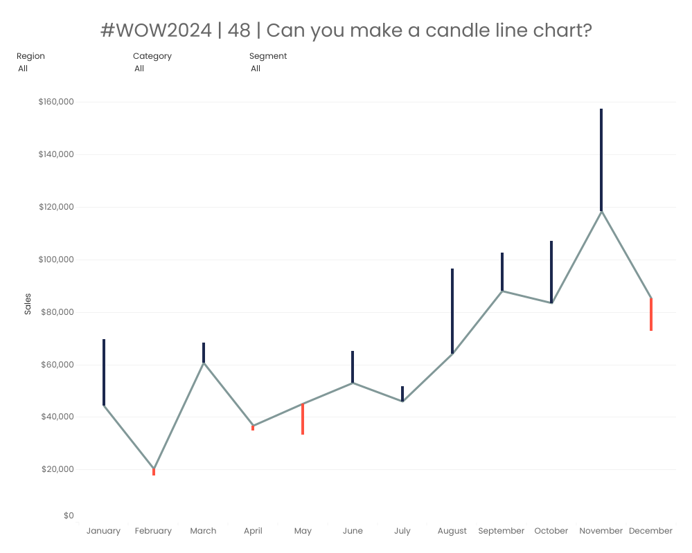
So what are doing this week? We’re gonna play different mark types on dual axis. This week’s challenge is something I’m calling a “candle line” chart. Check it out and have fun recreating it!
Requirements
Dashboard Size 1000×800
One worksheet
Create a line chart showing 2024 sales by month
- For each month visually show the difference from the 2023 Sales for the respective month
- Match Tooltips and formatting
- Colors
- Line – #819898
- Positive YoY – #1C284E
- Negative YoY – #FF5342
- Font
- Poppins (new Google font available on Tableau Public)
- Colors
Dataset
This challenge uses Sample Superstore data (2024 version) with no filters applied. You can find the data source on Data.World
Attribute
When you publish your solution on Tableau Public make sure to take the time and include a link to the original inspiration. Also include the hashtag #WOW2024 in your description to make it searchable!

Share
After you finish your workout, share your solution:
- On Twitter using the hashtag #WOW2024 #Tableau and tag @WorkoutWednsday, @whereismytrain and @_hughej
- On LinkedIn using the tag Workout Wednesday, Tableau, Valerija Kirjackaja and Erica Hughes
