Introduction
It’s my first challenge of 2025!
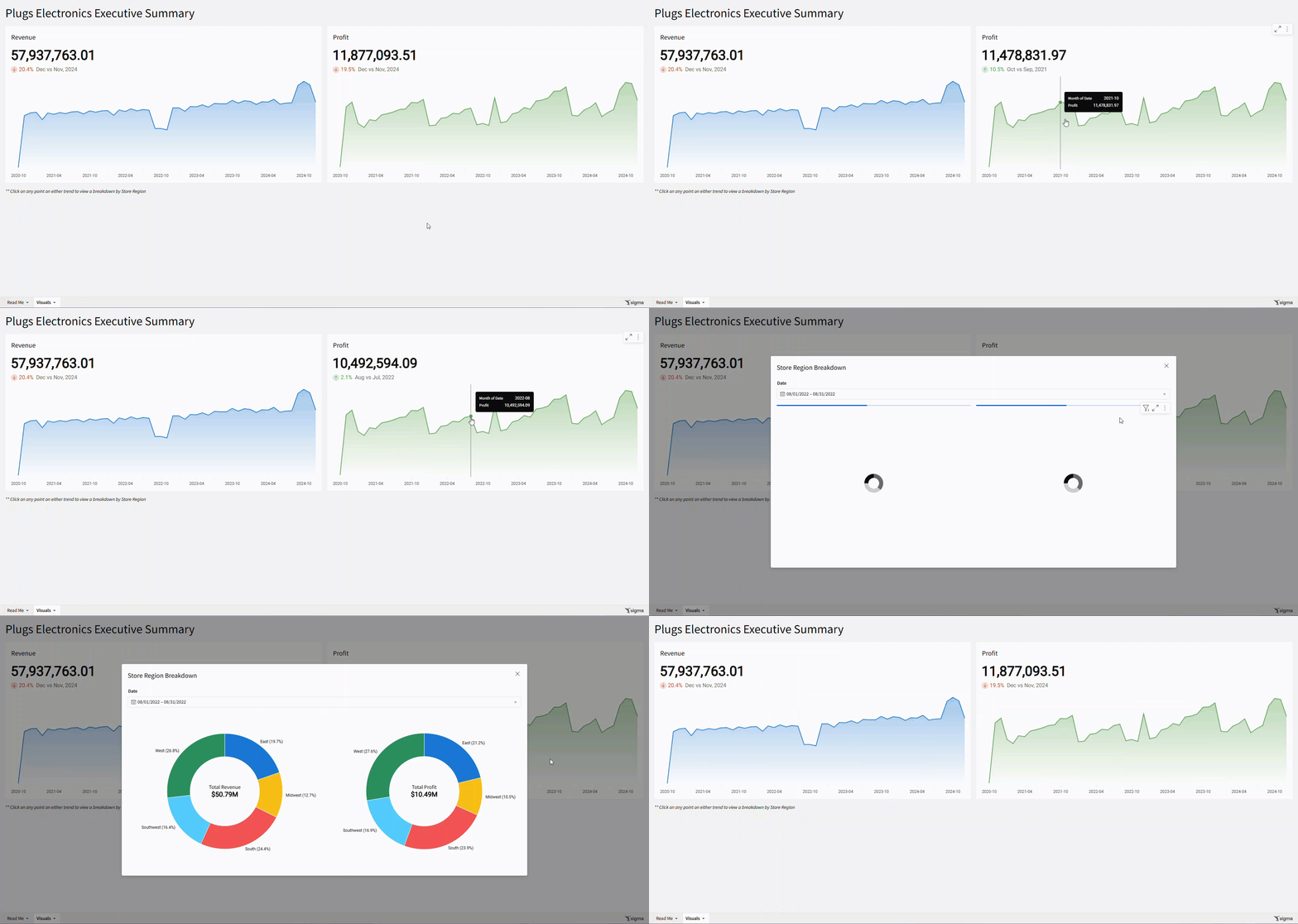
This week, we’re going to learn a new Sigma feature: Modals. Modals are pop-up windows that could be used for many things, like a form for an input table or to provide more detailed information. We’re going to use them to provide a breakdown on an Executive Summary.
C-Levels are often most concerned with high level summaries and do not want to be bogged down by more detailed visualizations. Modals are a great way to provide those details only when executives want them.
Good Luck!
-Ashley
Need access to Sigma?
Note: You will only have view access to WOW Workbooks, Folders, and Workspaces, not edit access. Please create your WOW Workbooks under “My Documents.” We suggest creating a folder to organize all your workbooks.
Requirements
- On a hidden Data Tab:
- First, we want to add our source data: Sigma Sample Database / RETAIL / PLUGS_ELECTRONICS / PLUGS_ELECTRONICS_HANDS_ON_LAB_DATA
- Note the metrics that we will be using:
- Revenue: Sum([PRICE] * [QUANTITY])
- Profit: Sum(([PRICE] – [COST]) * [QUANTITY])
- Note the metrics that we will be using:
- First, we want to add our source data: Sigma Sample Database / RETAIL / PLUGS_ELECTRONICS / PLUGS_ELECTRONICS_HANDS_ON_LAB_DATA
- On a new, large width Modal:
- Create a Donut chart, using our data table as its source:
- Color: Store Region
- Value: Revenue
- Donut Hole Value: Revenue, renamed to Total Revenue
- Format this to SI Units with a $ in front
- Do not show Title or Legend
- Show Data Labels with Color and Percent with 1 decimal place
- Create a Date Range page control that targets this Donut
- Create a duplicate KPI Chart that analyzes Profit
- Show the Modal’s Title: Store Region Breakdown
- Show the Close Icon
- Do not show the footer buttons
- Arrange the Modal so the donuts are side by side
- Create a Donut chart, using our data table as its source:
- On a visible tab:
- Create a KPI Chart, using our data table:
- Value: Revenue
- Timeline: Month of Date
- Comparison: Previous Month
- Show the Tooltip and Timeline Axis on the Trend
- Add a sequence of actions on select:
- Set the Date Range page control to the selected Month of Date
- Open your Modal
- Create a duplicate KPI Chart that analyzes Profit
- Change the color of this KPI’s trend
- Create a KPI Chart, using our data table:
- Finishing Touches
- Give the dashboard a descriptive title
- Add a text element that informs the user that clicking on any point will open a breakdown.
- Arrange your elements into a cohesive dashboard
Dataset
- Sigma Sample Database / RETAIL / PLUGS_ELECTRONICS / PLUGS_ELECTRONICS_HANDS_ON_LAB_DATA
Share
After you finish your workout, share on LinkedIn, Sigma’s Community page, (or Twitter) using the hashtags #WOW2024 and #SigmaComputing, and tag Ashley Bennett, Eric Heidbreder, Katrina Menne, and Michal Shaffer!
Create an interactive, sharable version of your solution here.
Also, make sure to fill out the Submission Tracker so that we can count you as a participant this week to track our participation throughout the year.
