Introduction
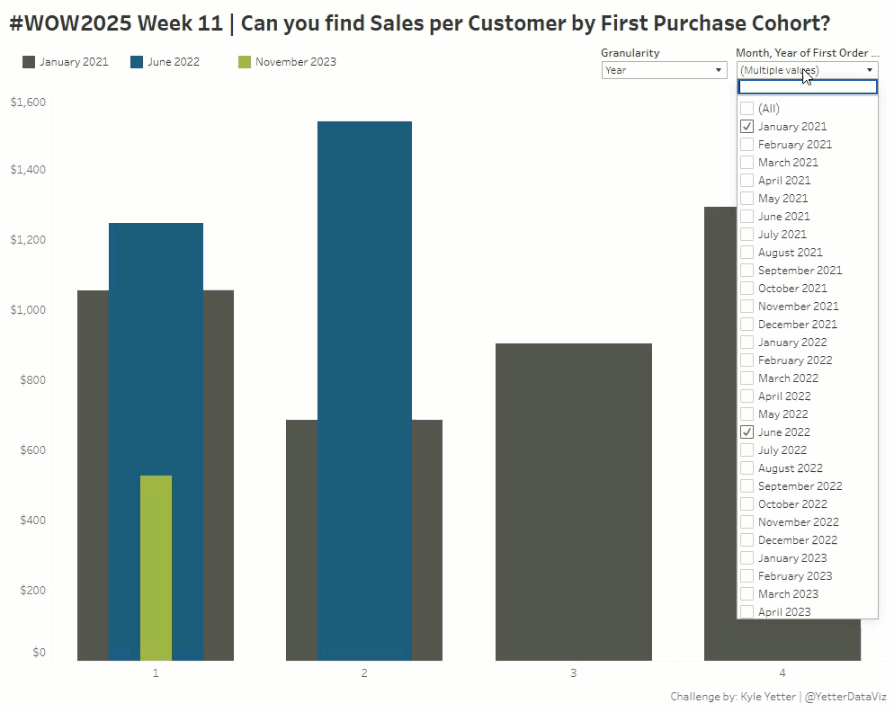
Cohort analysis is always fun to try and figure out how to show enough information without dumping every cohort onto a chart. This challenge looks at cohorts of when a first purchase was made (Superstore data), and subsequent sales to those customers. Are there certain cohorts that continually spend more money? Do certain cohorts continue to spend money with us compared to others?
That’s what we’ll dive in to a little bit in this week’s challenge, which is intended to allow the end user to mix and match monthly cohorts to answer the questions they have in mind. One shortcoming of this solution is the lack of dynamic color palette selection, meaning I want to have the same 3-4 colors appear in the same order, no matter which months I select. I tried to use Index(), but that didn’t hold up when there were months a cohort didn’t make a purchase. So if you have any ideas, I’d love to see potential solutions to that.
Requirements
- Size 1000×800
- 1 sheet
- Calculate the number of months between the customer’s first purchase date and the order date
- Filter to 3-4 first purchase date cohorts (I picked Jan 2021, May 2021, Jun 2022, and Nov 2023)
- Show Sales per Customer for each cohort
- Allow for selection to show by months or years since purchase date
- When years are selected, filter the view to show only fully completed years. For example, if I have May 2022, I would potentially have 30 months of data, but the 3rd year since first purchase would look small compared to others with a full 3rd year, so it needs to cut off at 24 months.
- Choose your own colors, but try to make sure the contrast works well with up to 4 colors.
Dataset
Available from here.
Attribute
When you publish your solution on Tableau Public make sure to take the time and include a link to the original inspiration. Also include the hashtag #WOW2025 in your description to make it searchable!

Share
After you finish your workout, share on Twitter and/or LinkedIn using the hashtag #WOW2025 #Tableau and tag @WorkoutWednsday
Solution
Interactive
