Introduction
One of things that I really enjoy about using Tableau is finding interesting charts “in the wild” and attempting to replicate them. Last month, I saw a Power BI WOW challenge from Meagan that looked really interesting and I wanted to try it out.
So here go! Can you visualize ranges?
Requirements
- Size 1300×600
- 1 sheet
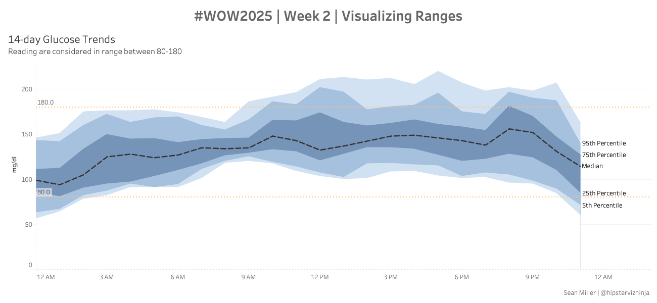
- Show the hourly median level as a dashed line
- show the following percentile ranges
- 5th
- 25th
- 75th
- 95th
- Layer and shade the ranges appropriately
- Add a dotted reference line/band showing the “normal” range of 80 to 180
Dataset
Available from here.
Attribute
When you publish your solution on Tableau Public make sure to take the time and include a link to the original inspiration. Also include the hashtag #WOW2025 in your description to make it searchable!

Share
After you finish your workout, share on Twitter and/or LinkedIn using the hashtag #WOW2025 #Tableau and tag @WorkoutWednsday
