Introduction
This week we are exploring user experience and design for CRM Analytics dashboards.
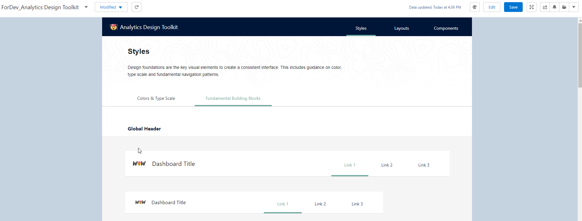
Design foundations are the key visual elements to create a consistent interface. This includes guidance on color, type scale and fundamental navigation patterns.
Using the Design Style Guide template app gives you a starting point for consistent and best practice design – so whether you are a beginner in the visual analytics space or have many users creating dashboards for a business where you need consistency in branding.
Requirements
- Within your Dev org create a new template app – Design Style Guide
- Run through all steps for app creation
- Once the app has completed, edit elements based on your required branding/theme
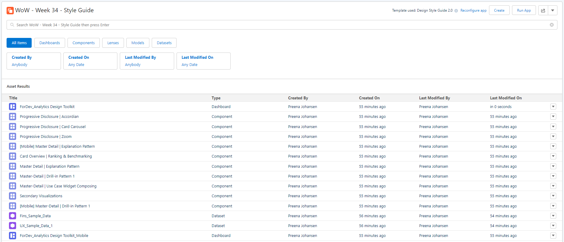
The resulting app should look like similar to the below, as well as one of the style dashboards.
Be sure to explore all elements created as part of the template app, there are some great ideas!


Check out the Theme’s coming in Winter 24 release: Create Consistent Dashboards with Themes
Dataset
This week doesn’t use any data – it uses a Template. If this is your first challenge, you can sign up for a dev org here: https://trailhead.salesforce.com/promo/orgs/analytics-de
Share
After you finish your workout, share a screenshot of your solutions or interesting insights on Twitter or LinkedIn using the hashtags #WOW2023 and #CRMA and tag @genetis, @PreenzJ, @LaGMills and @JaackParry. (Or you can use this handy link to do that)
Also make sure to fill out the Submission Tracker to track your progress and help us judge the difficulty of our challenges.