Introduction
Welcome to Week Forty-Eight! This week, I am heavily focused on my Thanksgiving preparations, so naturally, we will be taking our Workout Wednesday to the kitchen.
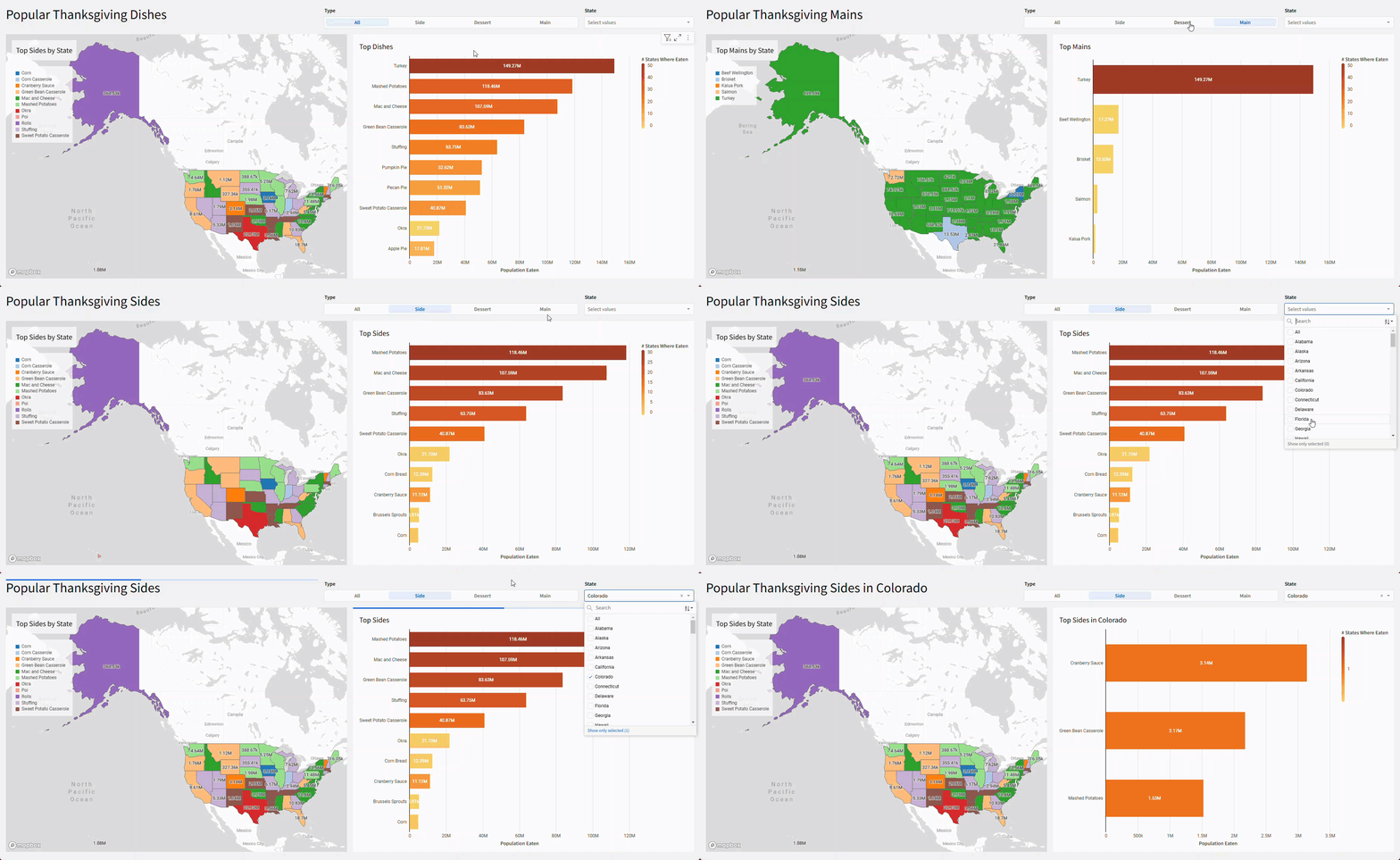
I asked Chat GPT to generate us a dataset involving popular Thanksgiving dishes by state. We’re going to use that to utilize some newer features, like a conditional action and map coloring by category.
Good Luck and to those in the US, Happy Thanksgiving!
-Ashley
Need access to Sigma?
Note: You will only have view access to WOW Workbooks, Folders, and Workspaces, not edit access. Please create your WOW Workbooks under “My Documents.” We suggest creating a folder to organize all your workbooks.
Requirements
- On a hidden Data Tab:
- First, we want to create a table with our filter values:
- Add the Top Thanksgiving Dishes in US States Data Model:
- Workspaces / Workout Wednesday / 2024 / 2024W48 – Can you map these dishes? / Top Thanksgiving Dishes in US States
- This table contains the most popular Main Course, Top 3 Side Dishes, and most popular Dessert in each of the 50 states, along with the number of people that typically eat that dish.
- Now we want to add a column called [Is State’s Top Type?] that will determine if the dish is the most popular for its type within each state. We do this because there are 3 possible Side Dishes for each state. To do this:
- Use the Lookup Wizard to find the Max Population Eating within the same Type and State.
- Then, make this column a Boolean by determining if that Lookup value matches the row’s Population Eating.
- Add the Top Thanksgiving Dishes in US States Data Model:
- First, we want to create a table with our filter values:
- On a visible page:
- Create a horizontal stacked bar graph:
- Y-Axis: Dish
- X: Sum of Population Eating formatted to SI Units
- Color by Scale: Create a Distinct Count to show the # of States Where Eaten
- Use a fall themed Color Scale
- ToolTip should show the full amount of Population Eating, not the SI Units
- Filter to Top 10 Population Eating
- Show Data Labels
- Show the X-Axis Title
- Show the Legend Header
- Title: Top Dishes
- Create a Segmented Page Control that filters [Type] and only targets the bar graph, not the underlying dataset, which we would usually do.
- Value Source should be the Data Source table.
- Show the clear option, and the text shown should say All
- Name the Control [Type]
- Create a List Page Control that filters [State] and only targets the bar graph
- Remove the null option
- Do not show the histogram
- Sort the suggestions A-Z
- Create a Map – Region:
- Region: State
- Color by Category: Dish
- Change the color palette to use one with more colors. I used the 3rd from the top, but you could define your own. The goal is to have as little color overlap as possible.
- Label: Sum of Population Eating formatted to SI Units
- Show Title: Top Dishes by State
- Because the map Category is based on Dish, you may notice that the tooltips do not display properly when more than one dish is present per state. To fix this, we will create 2 new filters that target the map only:
- First, duplicate, but don’t sync, the [Type] Segmented Page Control.
- Call this [Map-Type]
- Uncheck the “Show Clear Option”
- Move this control to the hidden page. Users can technically still see this hidden control and interact with it, but this is fine for our purposes.
- On the [Type] page control, create a conditional action:
- When [Type] is not null, set [Map-Type] equal to [Type]
- With this action, the bar graph and map will sync, unless the user selects “All” which will maintain the last selected value on the Map only.
- Additionally, filter the map to [Is State’s Top Type?] = True. A page control is not necessary
- First, duplicate, but don’t sync, the [Type] Segmented Page Control.
- I am choosing not to apply the [State] filter to the map, because I think the overview is more beneficial.
- If you would like the map to focus on the selected state, you could also target the map, or target the hidden Data Source table.
- Create a horizontal stacked bar graph:
- Finishing Touches
- Give the Page a Descriptive Title
- Arrange your elements into a cohesive dashboard. Don’t forget to move the controls to the visible page!
- Bonus
- In the Dashboard Title and the visual elements’ titles, add dynamic text to reflect the [Type] of Dish and [State] selected. Be sure your titles still make grammatical sense, despite which option is chosen!
Dataset
Workspaces / Workout Wednesday / 2024 / 2024W48 – Can you map these dishes? / Top Thanksgiving Dishes in US States
Share
After you finish your workout, share on LinkedIn, Sigma’s Community page, (or Twitter) using the hashtags #WOW2024 and #SigmaComputing, and tag Ashley Bennett, Eric Heidbreder, Katrina Menne, and Michal Shaffer!
Create an interactive, sharable version of your solution here.
Also, make sure to fill out the Submission Tracker so that we can count you as a participant this week to track our participation throughout the year.
Solution
Coming soon….
