Introduction
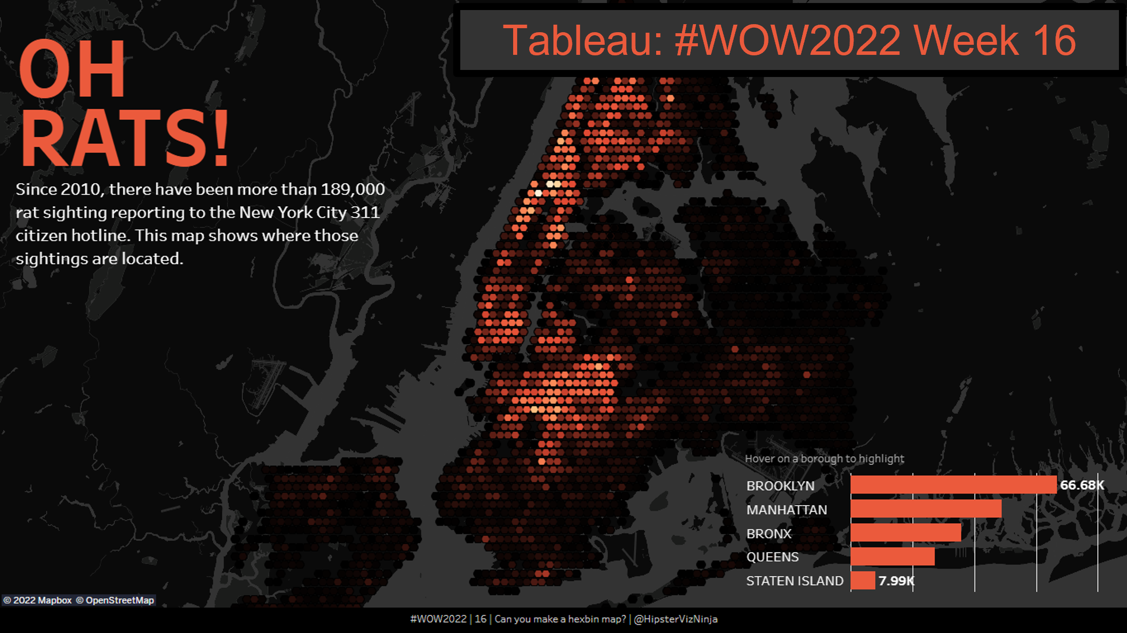
A few week’s ago, Sean Miller created an incredibly slick dashboard showing Rat Sightings in New York since 2010 for week 16 of Tableau’s Workout Wednesday (Challenge Link). The challenge used Hexbins to combine multiple map points into shapes of the same size to show density more clearly within a map. This week, we’re going to be recreating this visual in Power BI.

Requirements
- Create a Custom Map in Mapbox Studio
- Start with a blank template
- Set the land color to #000000 and water color to #333333
- Using the share options, make note of the access token and the MapBox URL as they will be used later within Power BI
- Add the map using MapBox Custom Visual within Power BI
- Connect your custom MapBox map using the options to fill in the MapBox URL and access token
- Grouping map points is as easy as rounding the latitudinal and longitudinal values
- Unselect auto zoom and set the following values (Zoom: 10.2; Latitude: 40.726; Longitude: -73.908)
- Additional Settings (Radius: 4px; Zoom Scale Factor: 1.2; Diverging: On; Minimum: #000000 at 0; Center: #D54718 at 400; Maximum: #FFFFFF at 2000)
- HINT: Rounding to 2 decimal points results in points that are too far apart and rounding to 3 decimals results in points that are too close together – Consider how you could round to the nearest 0.005
- Add a bar chart to show the rat sightings by park borough
- Set the canvas to 1366 x 768 and perform final formatting to match the visual
GOOD LUCK
Dataset
This week you can find the data here from the NYC Open Data portal.
Share
After you finish your workout, share on Twitter using the hashtags #WOW2022 and #PowerBI, and tag @JSBaucke, @MMarie, @shan_gsd, @KerryKolosko, and @NerdyWithData. Also make sure to fill out the Submission Tracker so that we can count you as a participant this week in order to track our participation throughout the year.